
Pokemon Coloring Pages
Pokémon, with its vast array of unique creatures, has captivated fans for years. Whether you’re a fan of Pikachu, Charmander, or any other character from the Pokémon universe, Pokémon coloring pages provide a fun and creative way to interact with these beloved characters. Whether you’re looking for a relaxing activity or something to keep your children entertained, these printable Pokémon coloring pages are a fantastic choice.
Coloring is not only an enjoyable hobby, but it also helps boost creativity and improve fine motor skills. With such a diverse collection of Pokémon coloring pages available, you’ll always have new designs to explore. From simple patterns suited for younger audiences to more intricate designs for older Pokémon fans, there’s something for everyone to enjoy.
Free Printable Pokemon Coloring Pages
One of the great advantages of Pokémon coloring pages is that many of them are easily accessible and free to download. Parents and educators can quickly print them out for children to enjoy at home or in the classroom. The availability of free Pokémon coloring pages makes it an excellent go-to activity for all occasions. Whether it’s a quiet afternoon, a road trip, or a break from screens, coloring is an engaging way to pass the time.
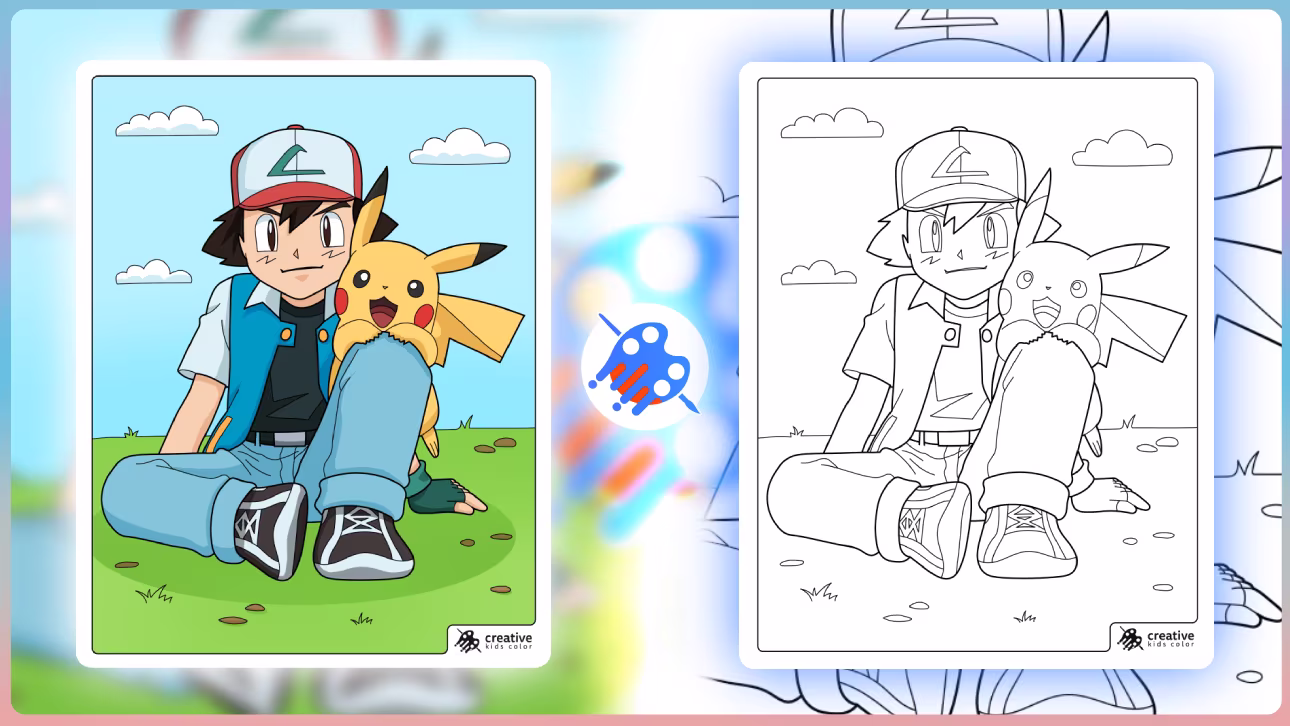
Pokemon Ash and Pikachu Walking Together
Ash smiles while holding Pikachu in his arms.
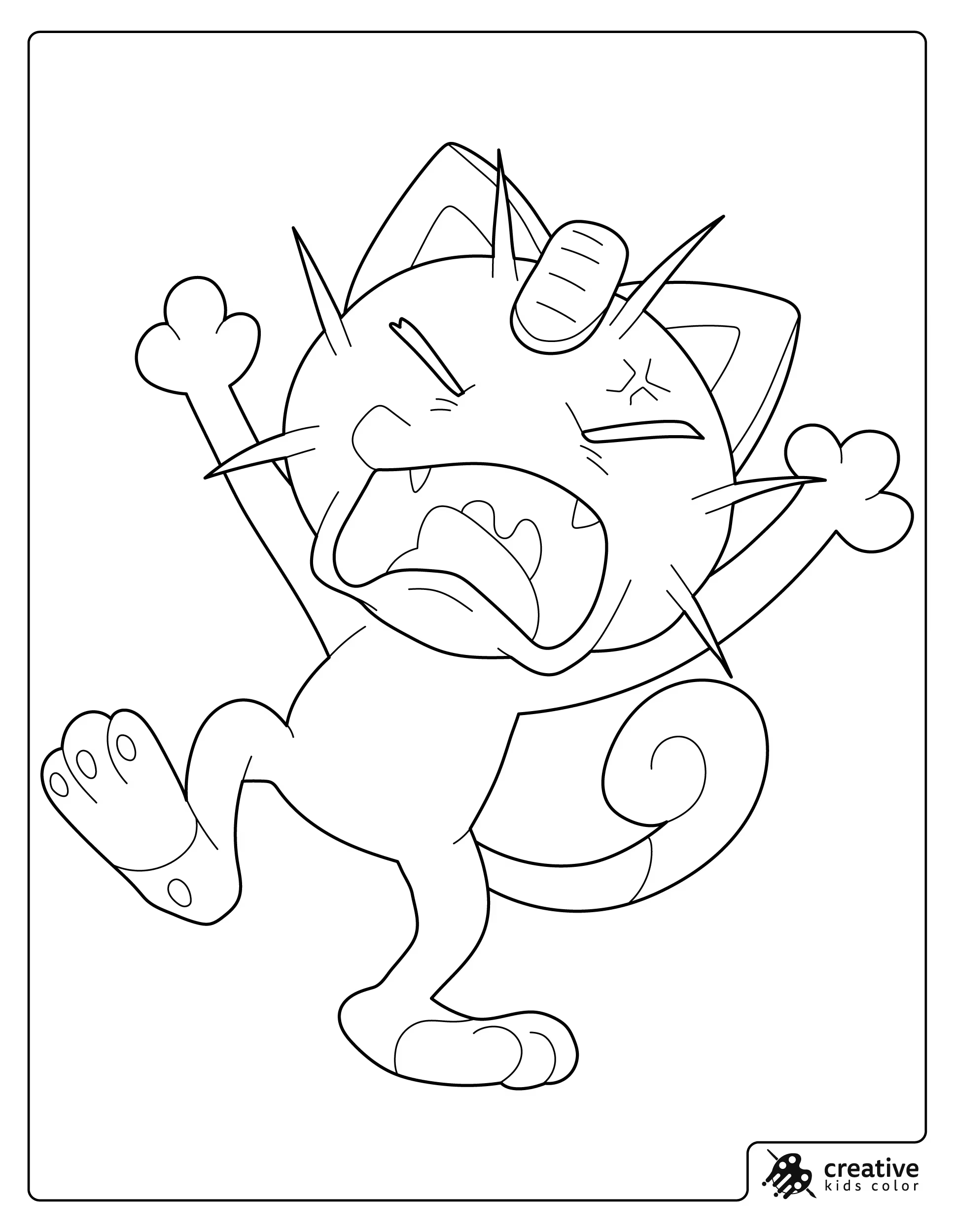
Pokemon Meowth Shouting Loudly
Meowth shouts with its arms raised.
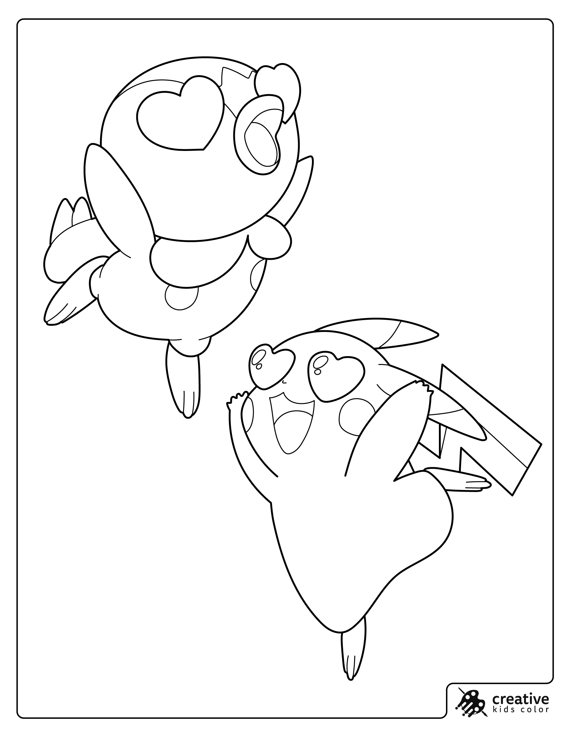
Pokemon Pikachu and Piplup Floating Happily
Pikachu and Piplup float upward with joyful expressions.
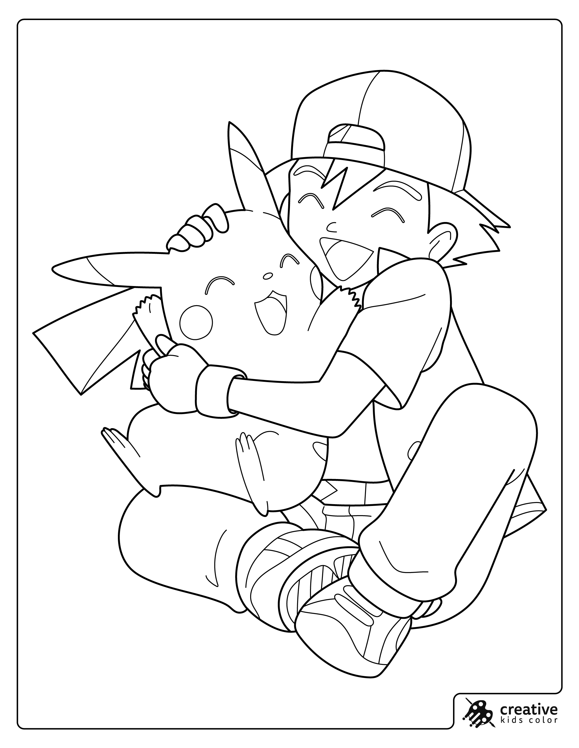
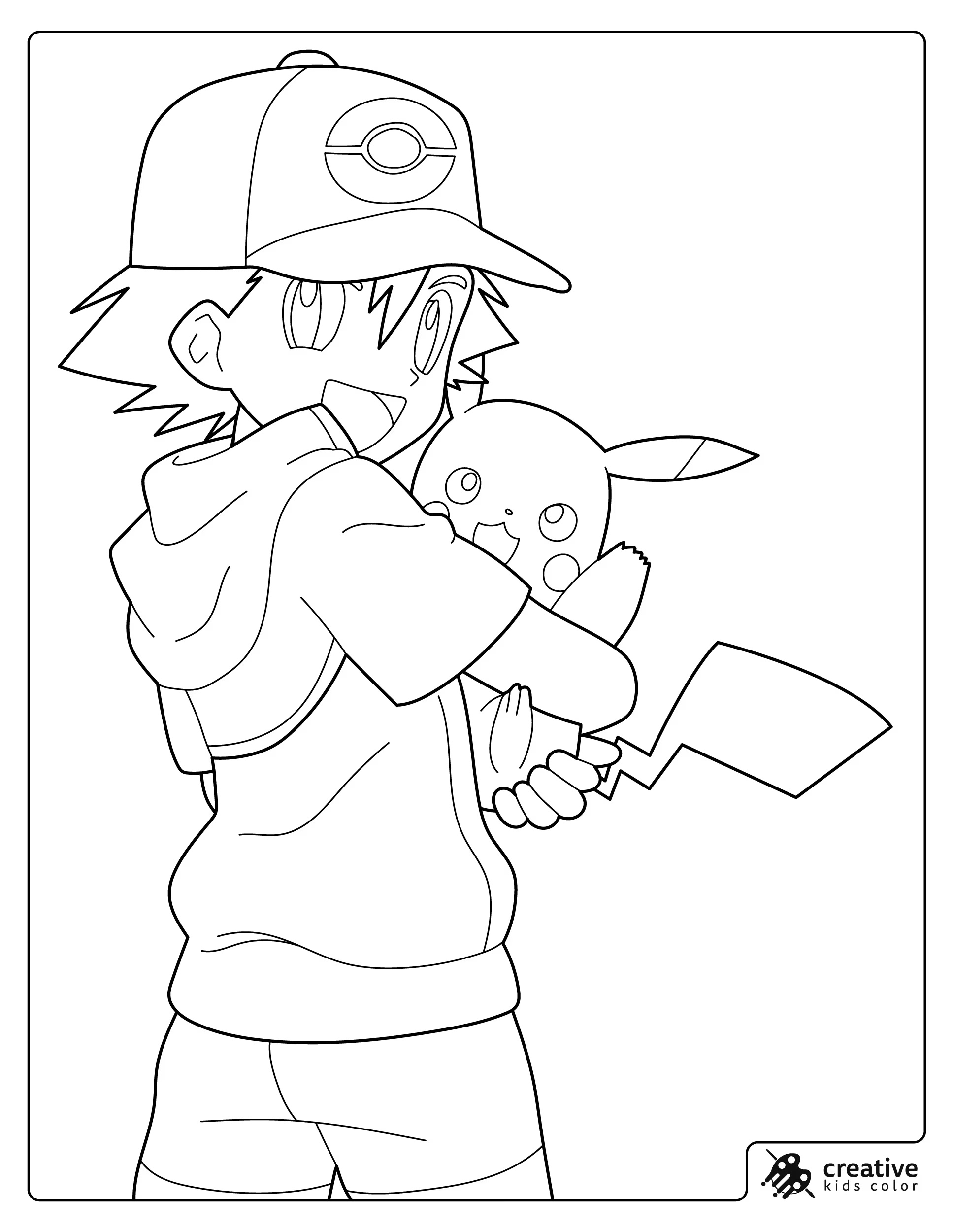
Pokemon Ash and Pikachu Hugging
Ash hugs Pikachu tightly as both smile.
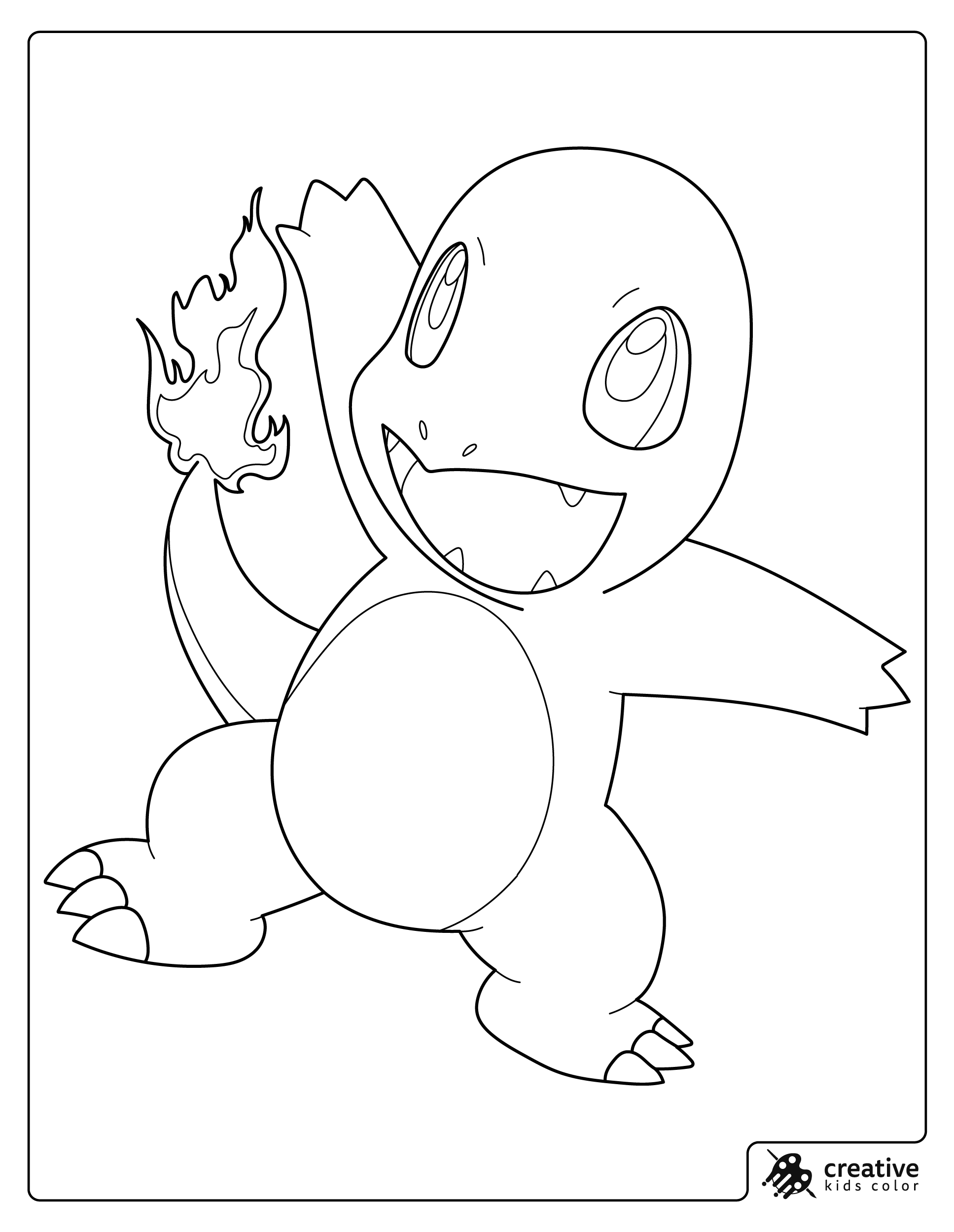
Pokemon Charmander with a Bright Flame
Charmander raises an arm as its tail flame burns brightly.
Pokemon Eevee Standing Proudly
Eevee stands with its fluffy tail curled behind it.
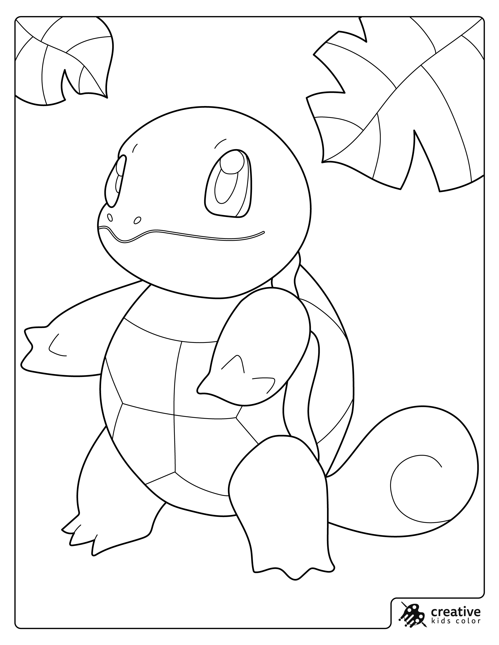
Pokemon Squirtle Under the Leaves
Squirtle stands beneath large hanging leaves.

Pokemon Bulbasaur Smiling Forward
Bulbasaur stands with a cheerful expression.
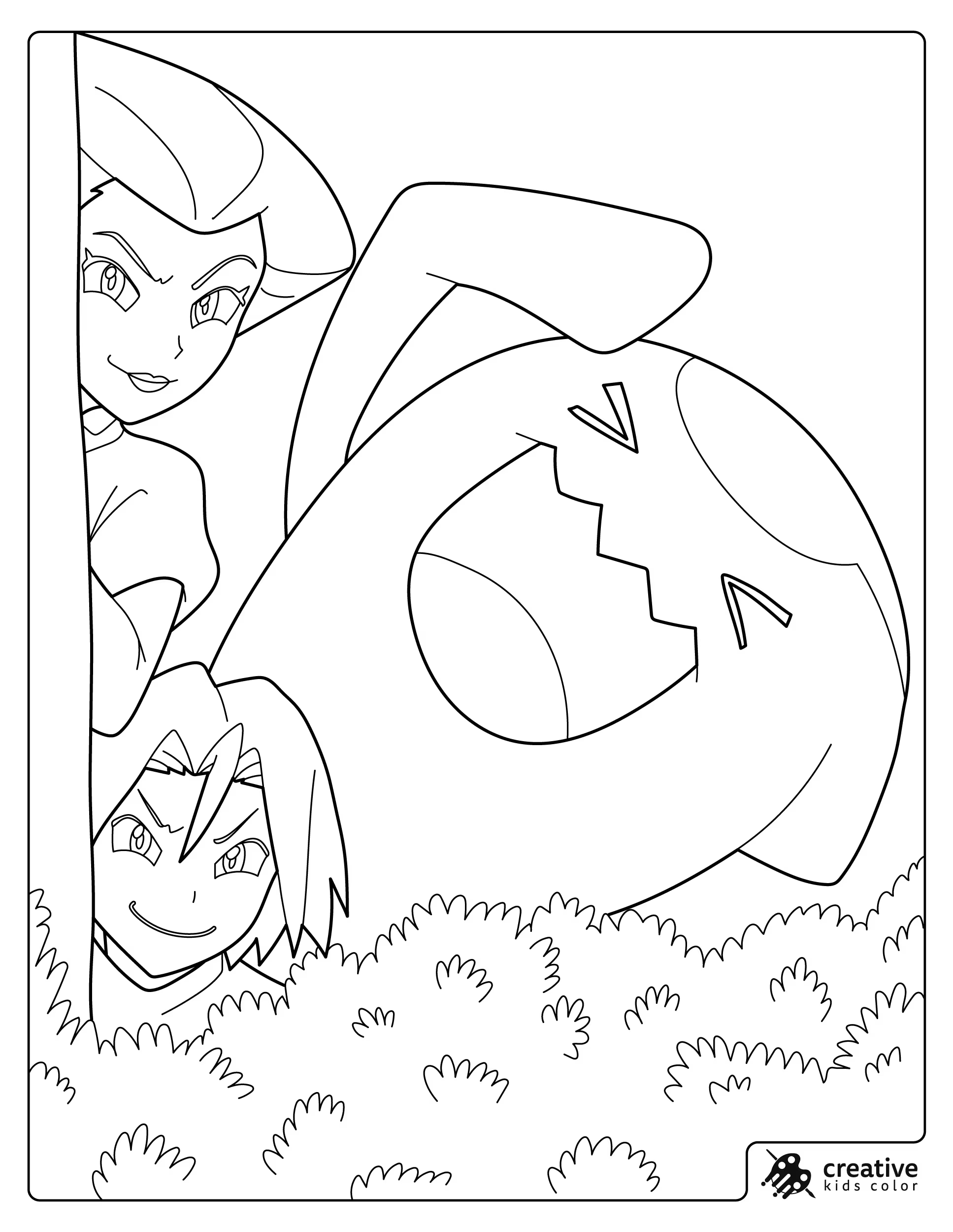
Pokemon Jessie, James and Wobbuffet Behind the Bushes
Jessie, James and Wobbuffet peek from behind a tree and bushes.
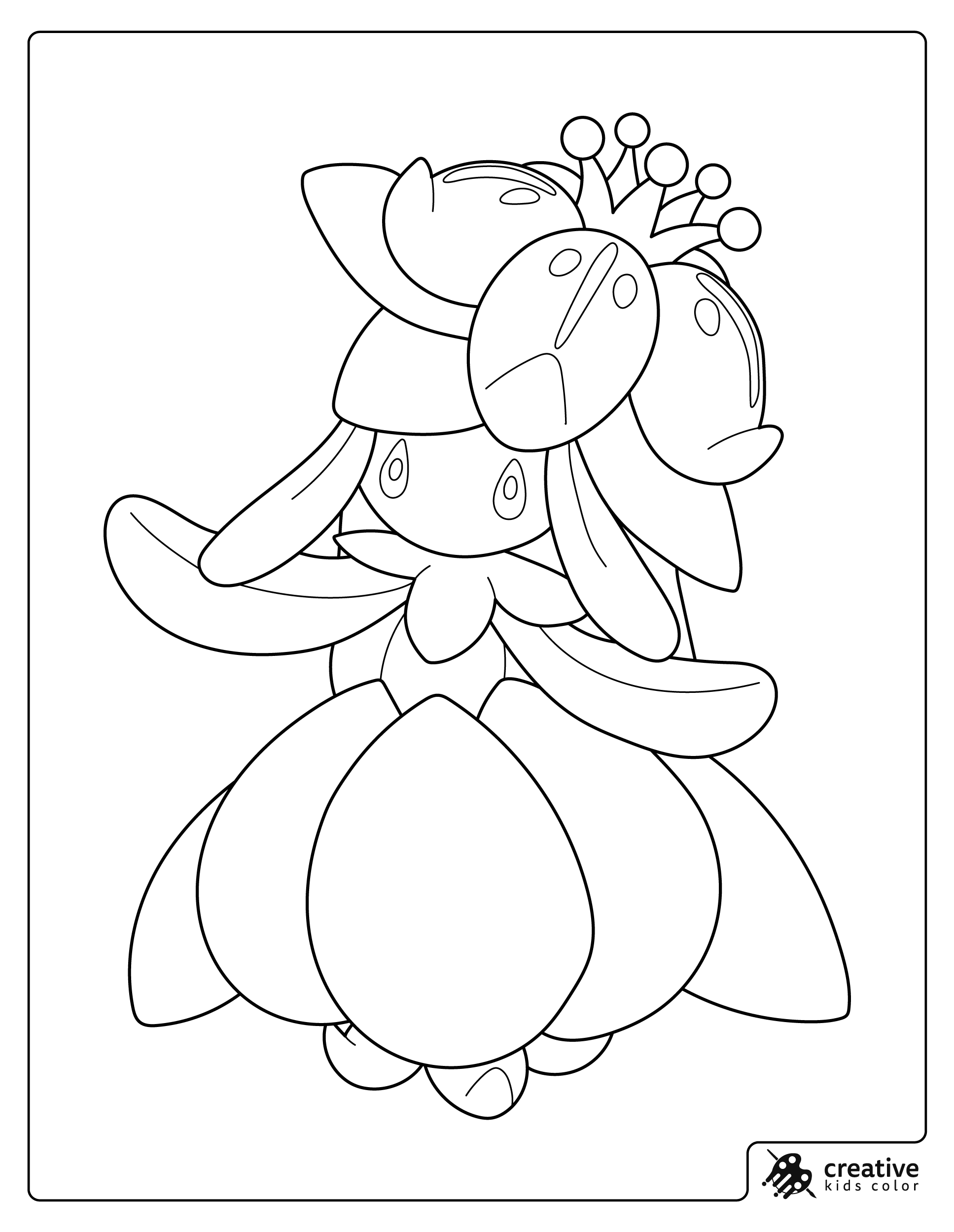
Pokemon Lilligant Standing Gracefully
Lilligant stands with its flower like petals spread out.
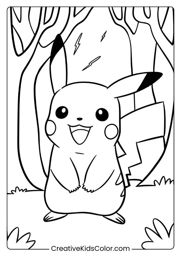
Pikachu in the Electric Forest
Pikachu stands in a forest with lightning bolts overhead, showing its electric power.
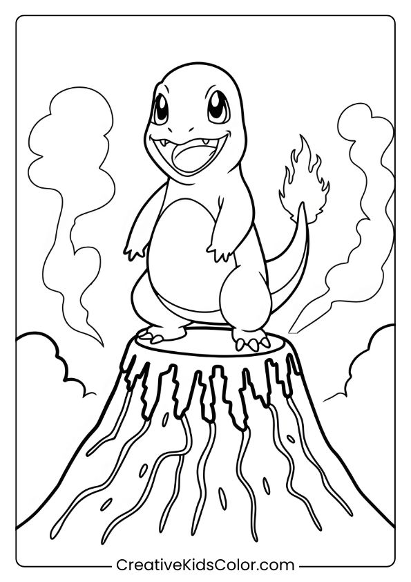
Charmander on Top of the Volcano
Charmander stands on a volcano with its tail aflame.
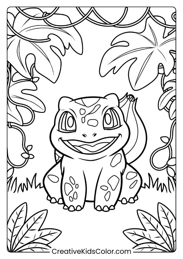
Bulbasaur in the Lush Jungle
Bulbasaur explores a jungle surrounded by large leaves and vines.
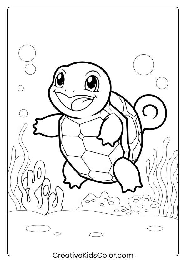
Squirtle Exploring Underwater
Squirtle swims happily in an underwater reef with bubbles around.
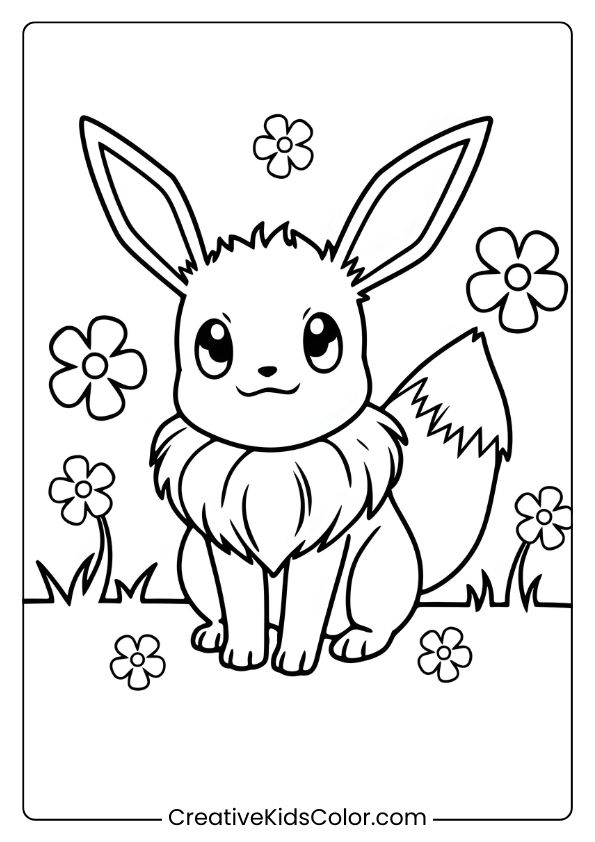
Eevee in the Flowering Meadows
Eevee sits in a field of flowers with a cheerful expression.
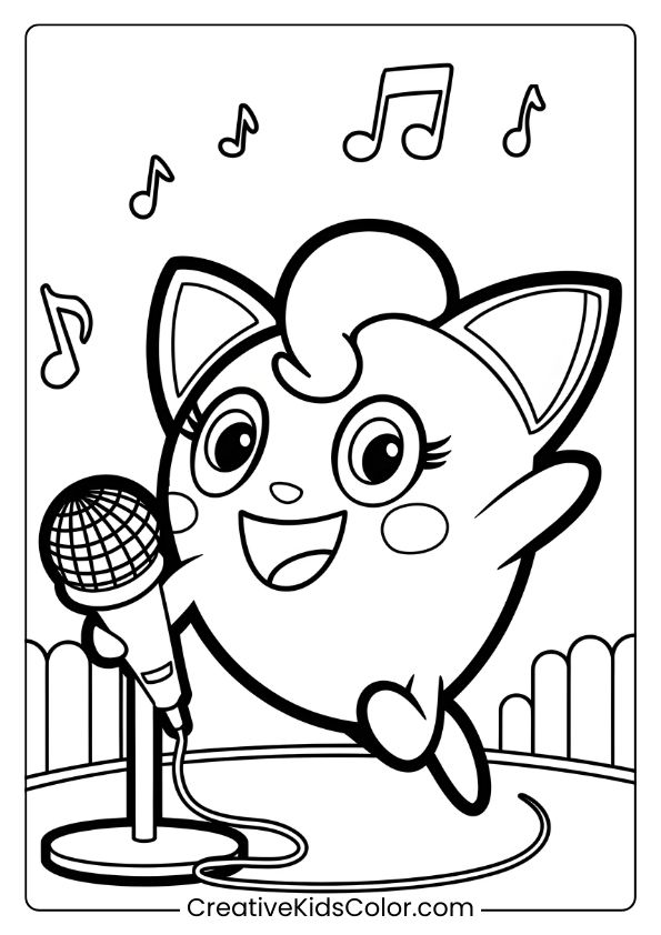
Jigglypuff Singing on the Stage
Jigglypuff performs on stage, singing into a microphone.
Gengar Haunting the Spooky Forest
Gengar lurks in a spooky forest with a mischievous grin.
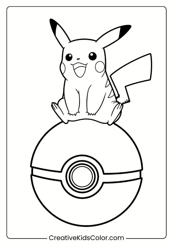
Pikachu on a Giant Pokeball
Pikachu sits on a large Pokéball with its tail pointing up.
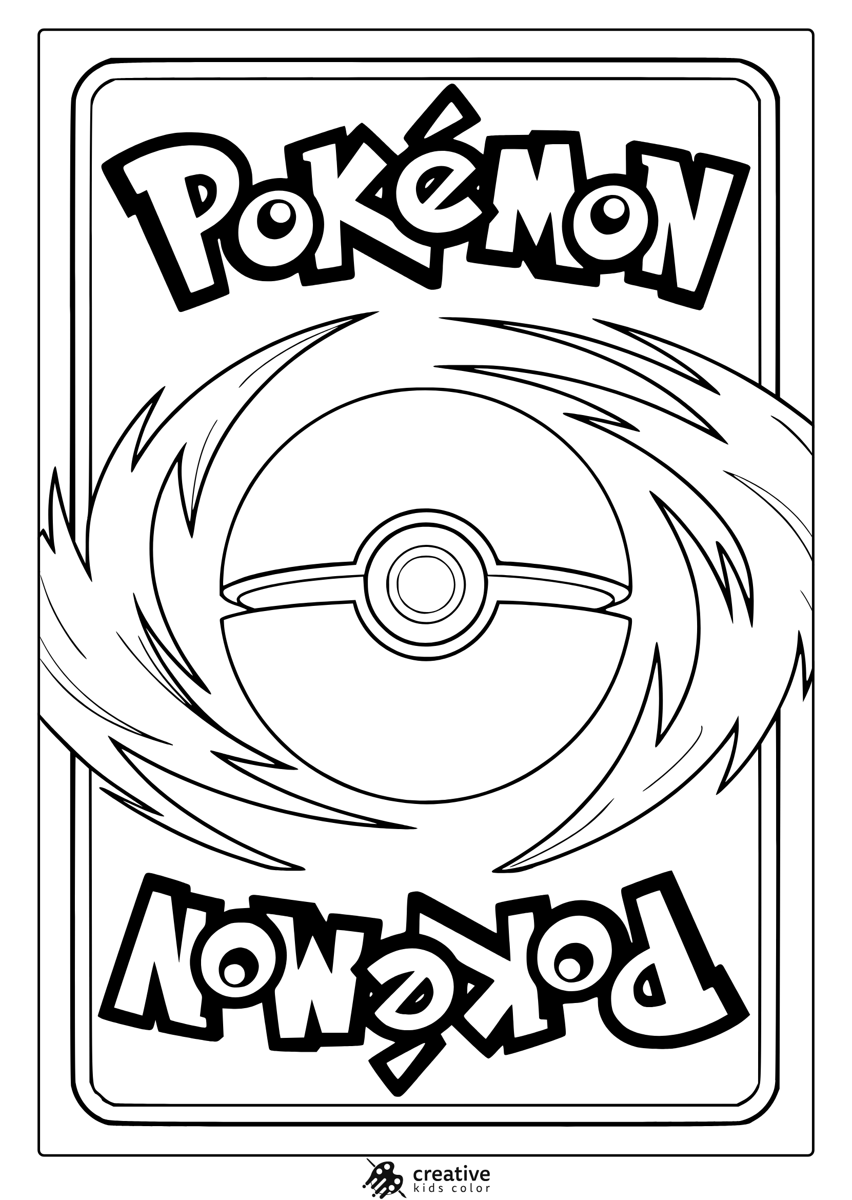
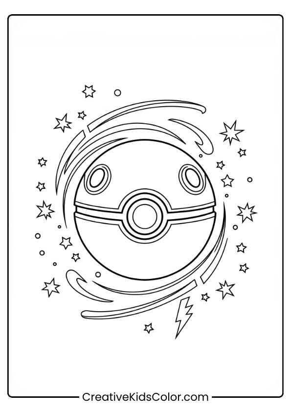
Pokemon Card Coloring Page
A fun card-style design featuring a bold Poké Ball and swirling energy, perfect for coloring fans.
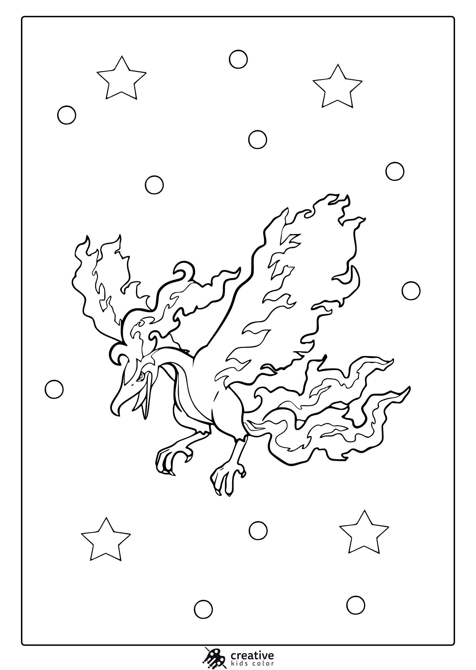
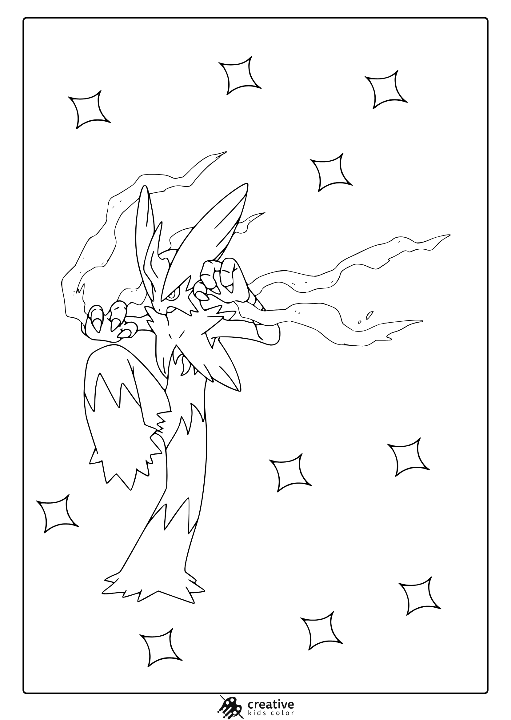
Legendary Pokemon Coloring Page (Legendary Moltres)
Capture the fiery magic of Legendary Moltres in this detailed phoenix inspired coloring page.
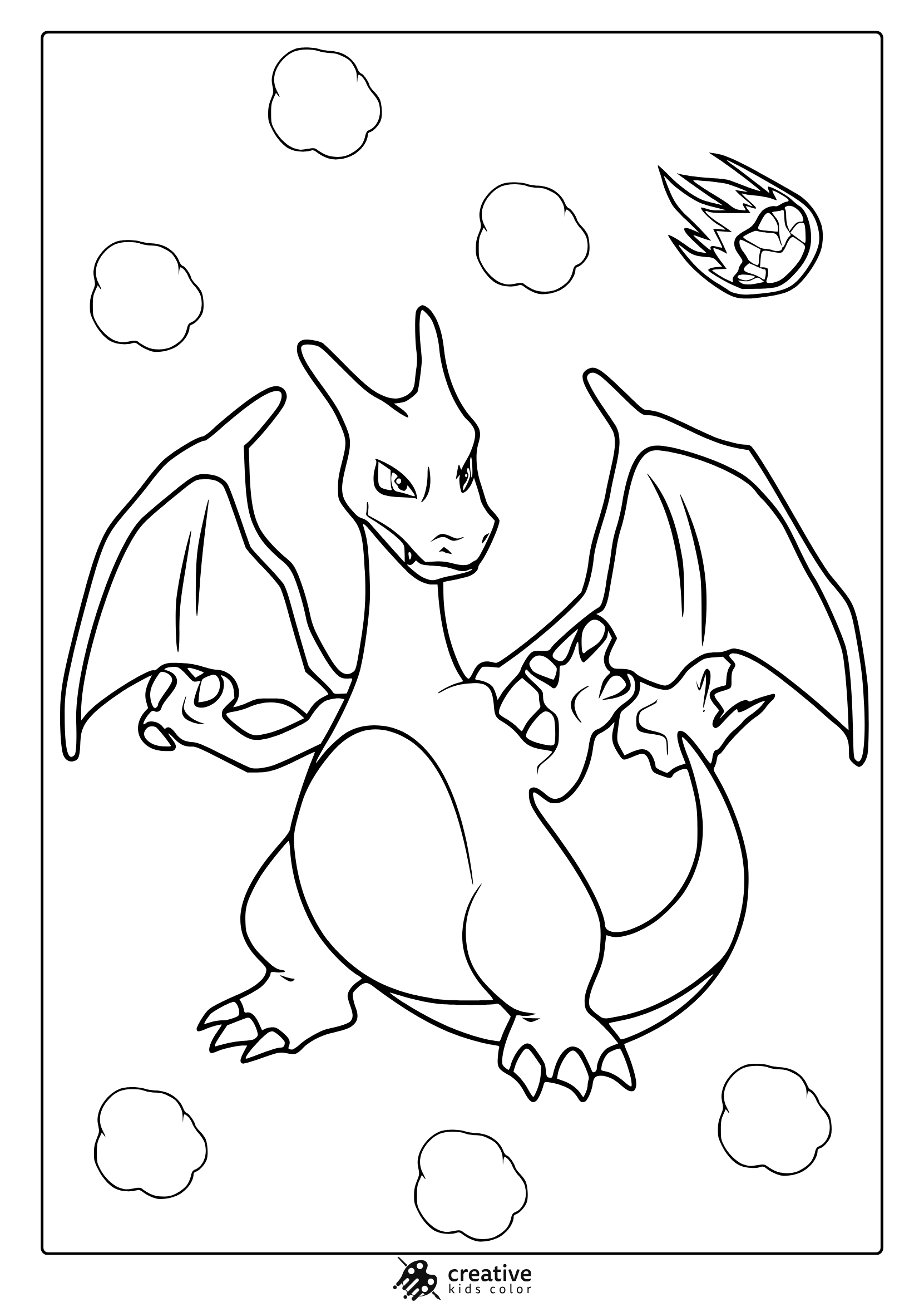
Charizard From Pokemon Coloring Page
Charizard soars with fire and strength among clouds and a blazing comet.
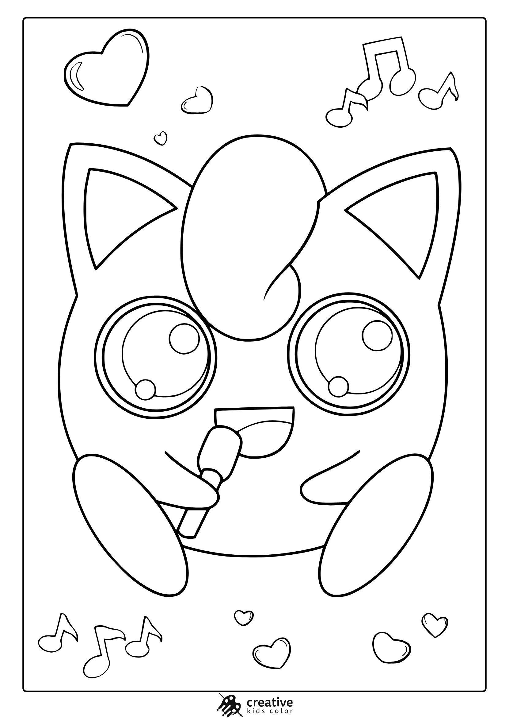
Jigglypuff From Pokemon Coloring Page
Jigglypuff sings with joy, surrounded by musical notes and hearts in a sweet coloring scene.
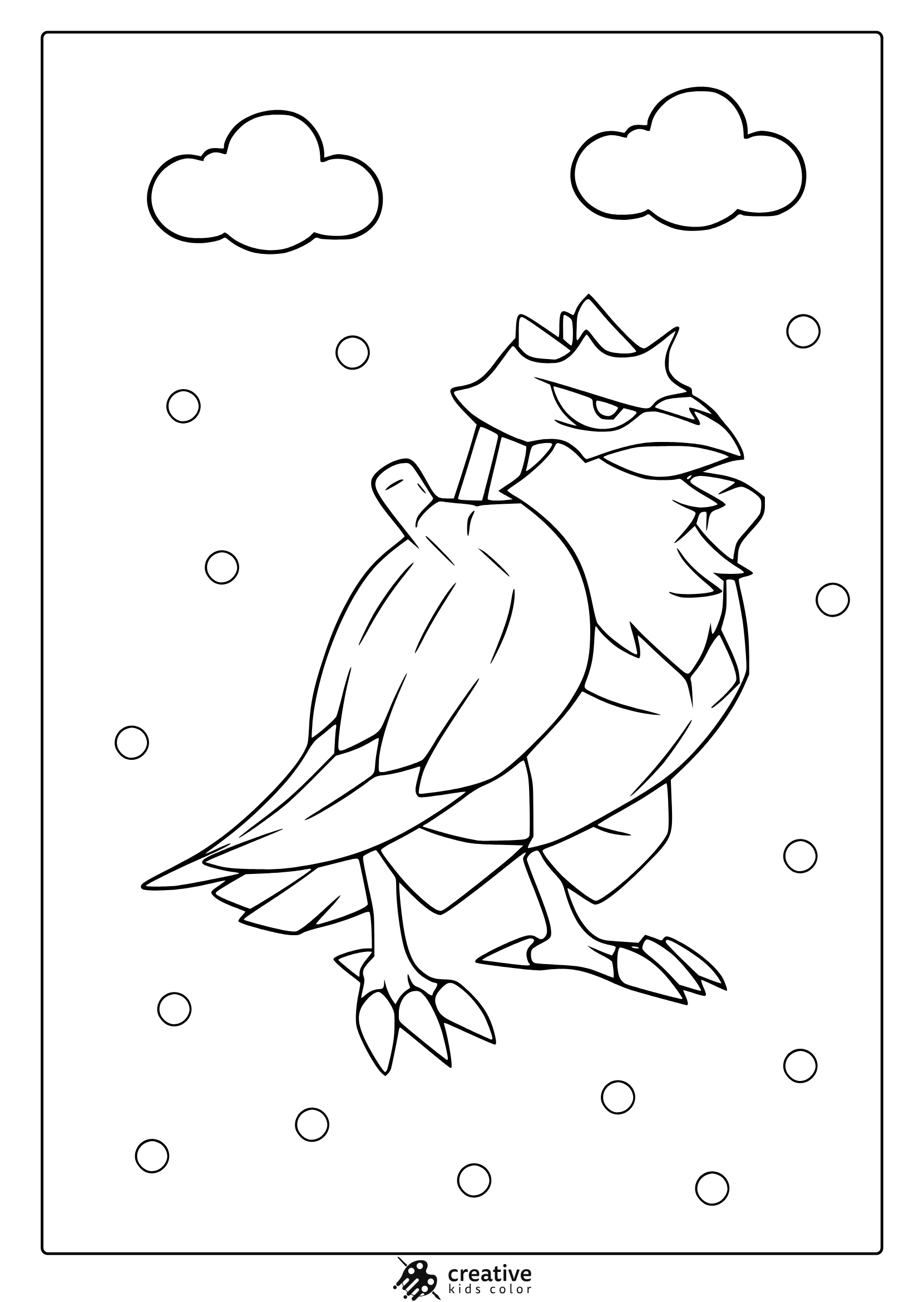
Corviknight From Pokemon Coloring Page
Corviknight stands tall in a snowy scene with clouds and detailed feathers to color.
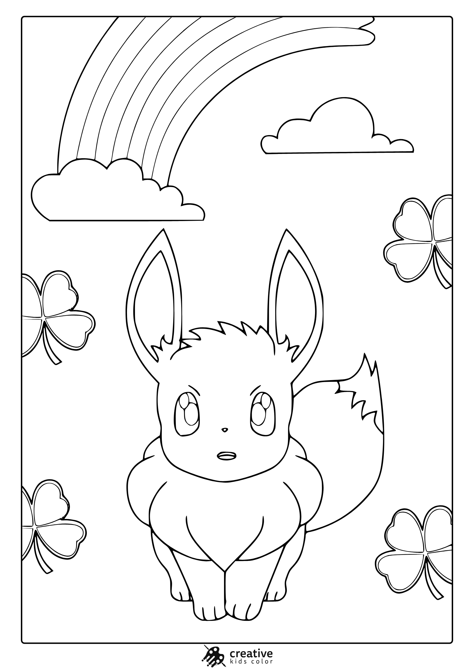
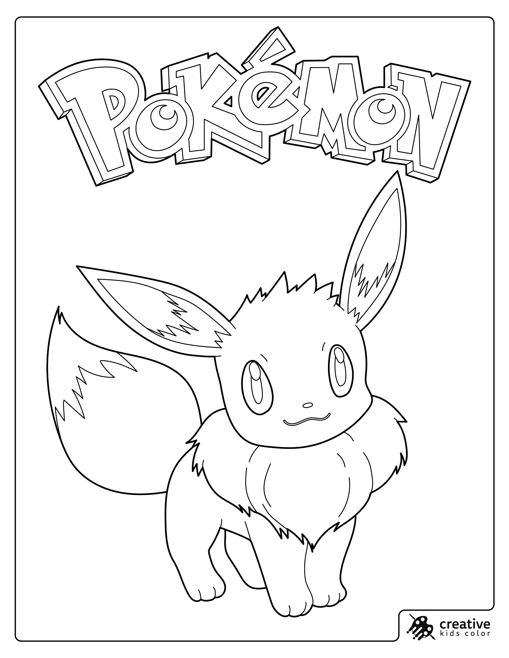
Eevee From Pokemon Coloring Page
Eevee shines beneath a rainbow with clovers all around in this charming scene.
Pokemon Badges And Logo Coloring Page
This design features the iconic Pokémon logo and magical crystals perfect for detailed coloring.
Venusaur From Pokemon Coloring Page
Venusaur appears bold and whimsical, surrounded by stars in a magical coloring moment.
Blaziken From Pokemon Coloring Page
Blaziken bursts with fiery energy in this dynamic action ready coloring design.
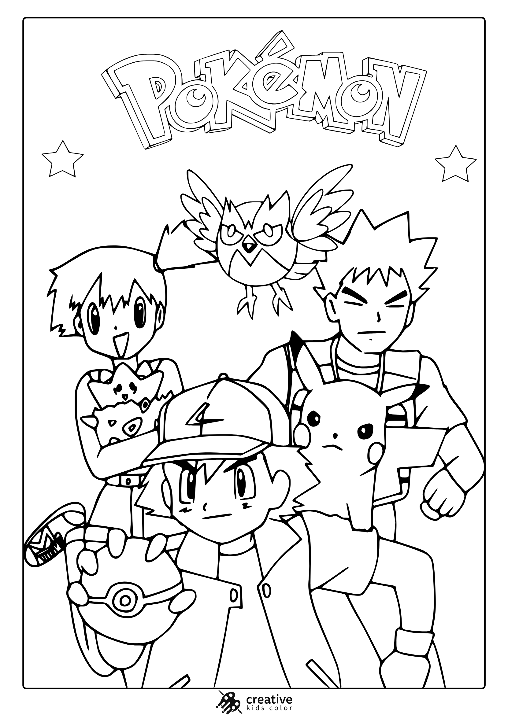
Ash with Brock and Misty From Pokemon Coloring Page
Join Ash, Brock, Misty, and Pikachu in this fun group coloring page adventure.
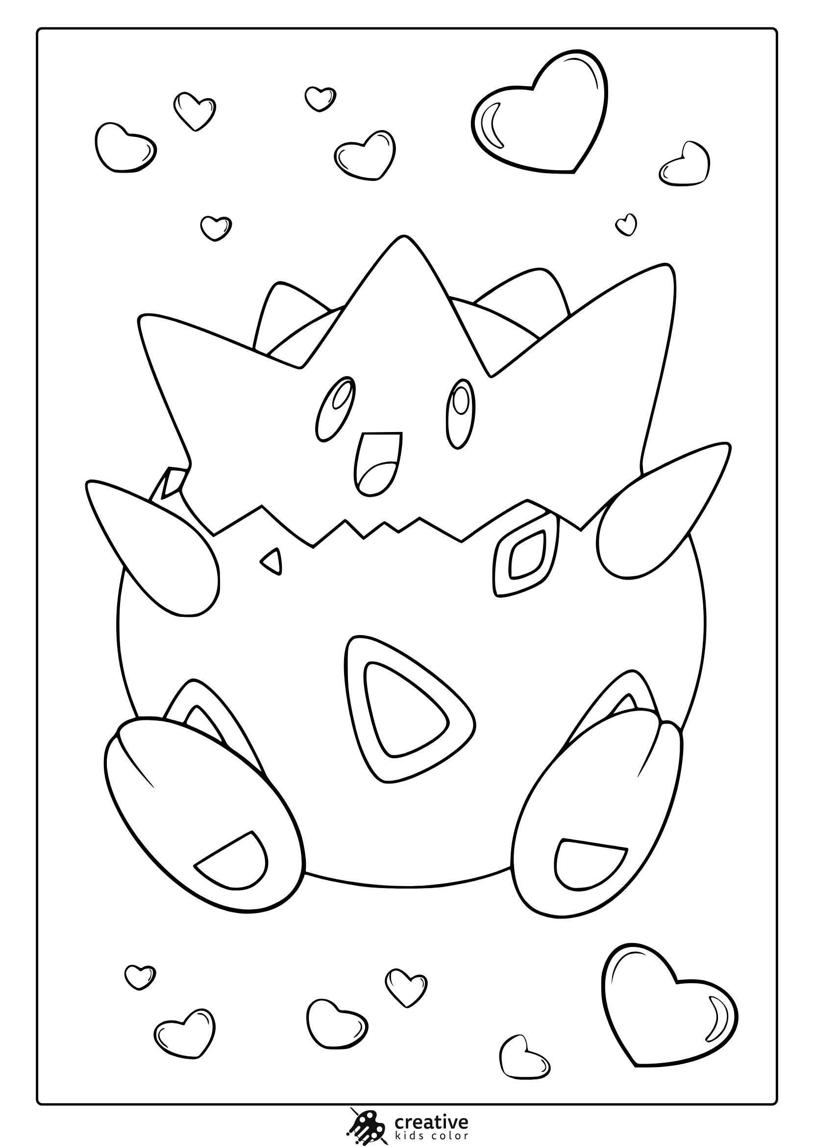
Togepi From Pokemon Coloring Page
Togepi smiles with floating hearts in this adorable coloring page scene.
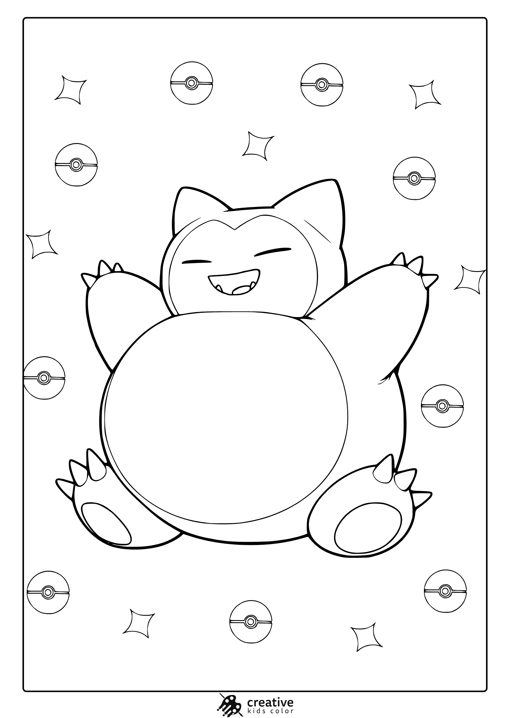
Snorlax From Pokemon Coloring Page
Snorlax is all smiles, relaxing among Poké Balls and sparkles in this cozy coloring scene.
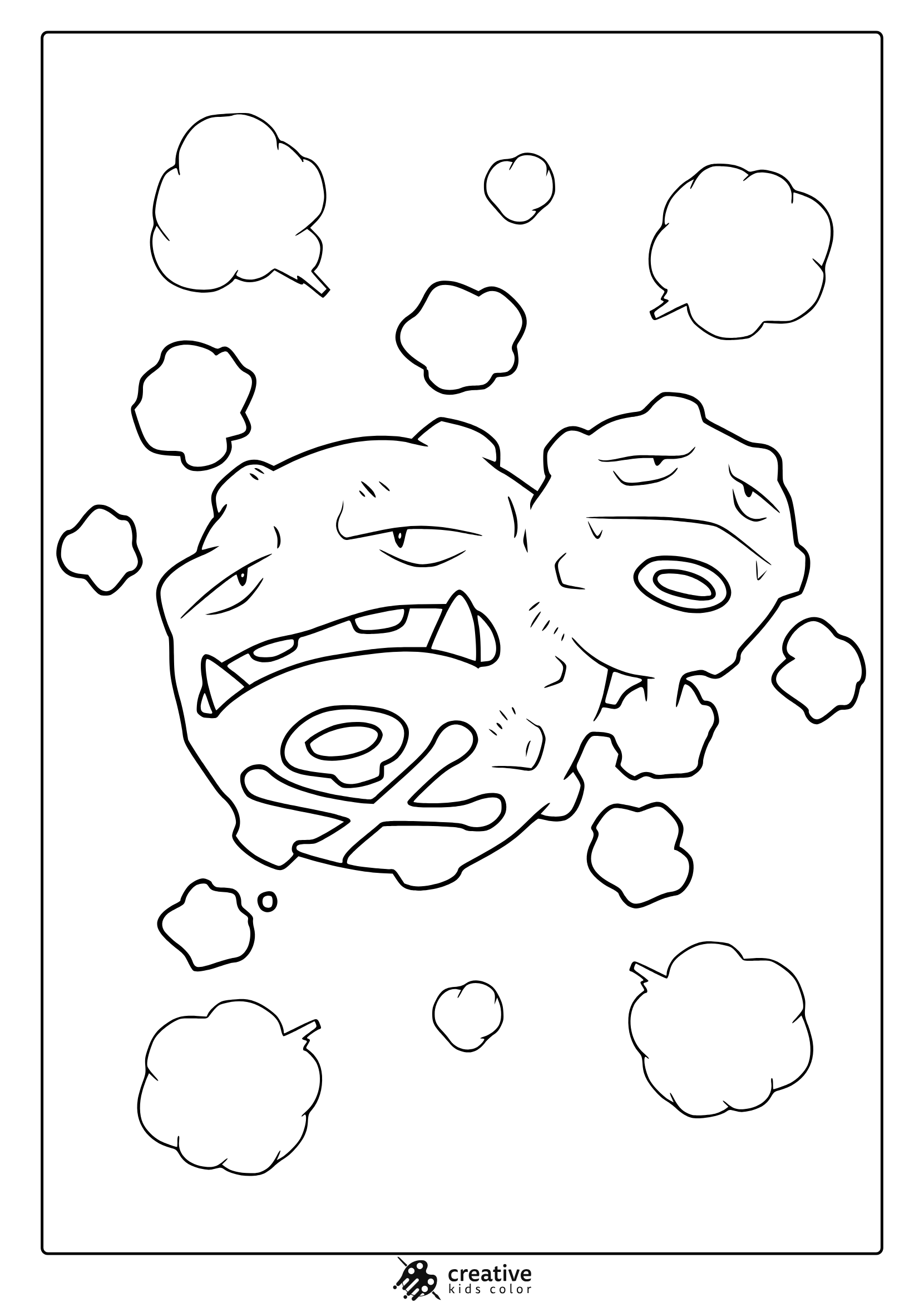
Koffing From Pokemon Coloring Page
Two Koffing faces rise from a cloud of mischief in this quirky and fun coloring design.
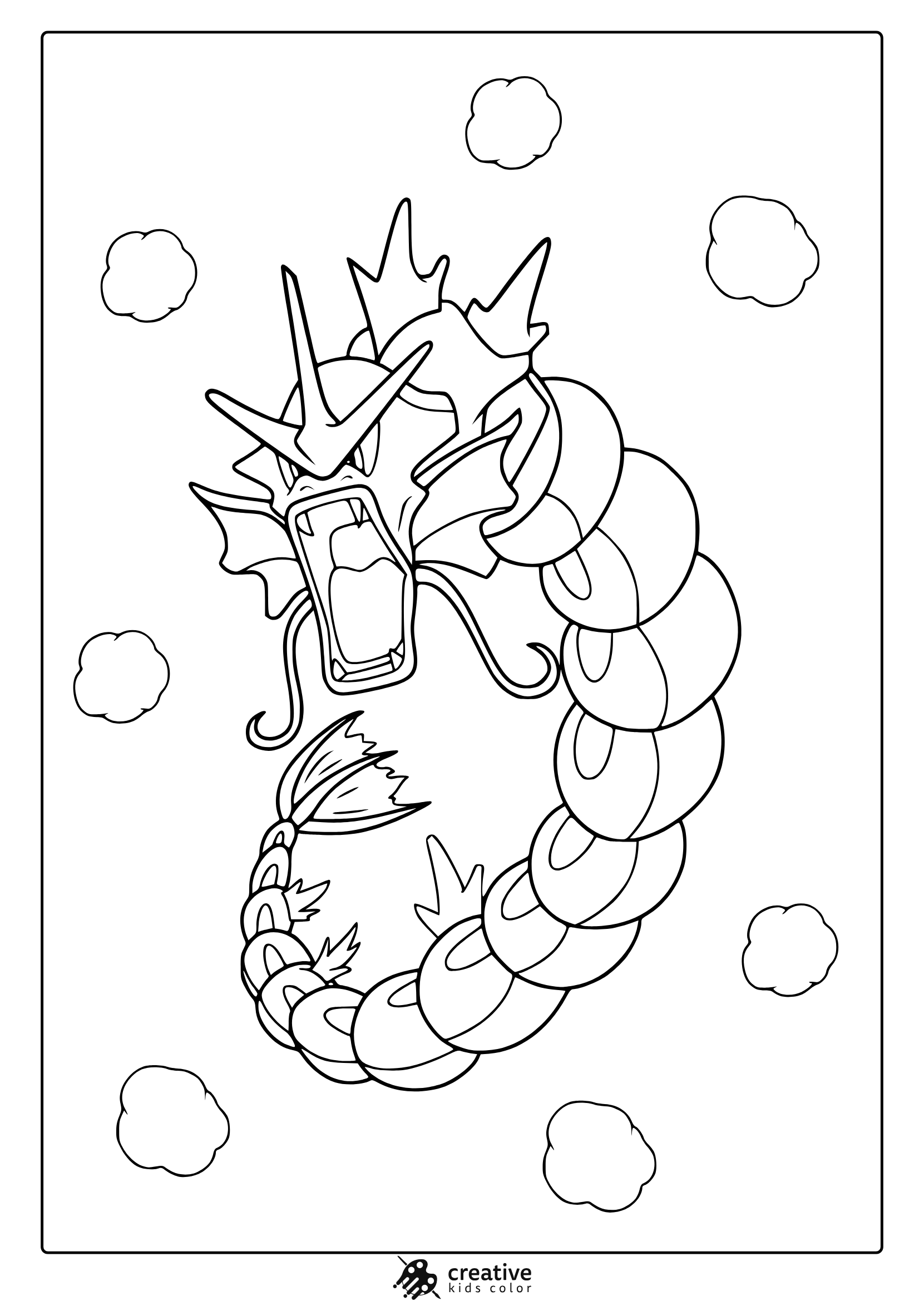
Gyarados From Pokemon Coloring Page
Gyarados transforms with a tech twist, winding through clouds in a unique coloring scene.
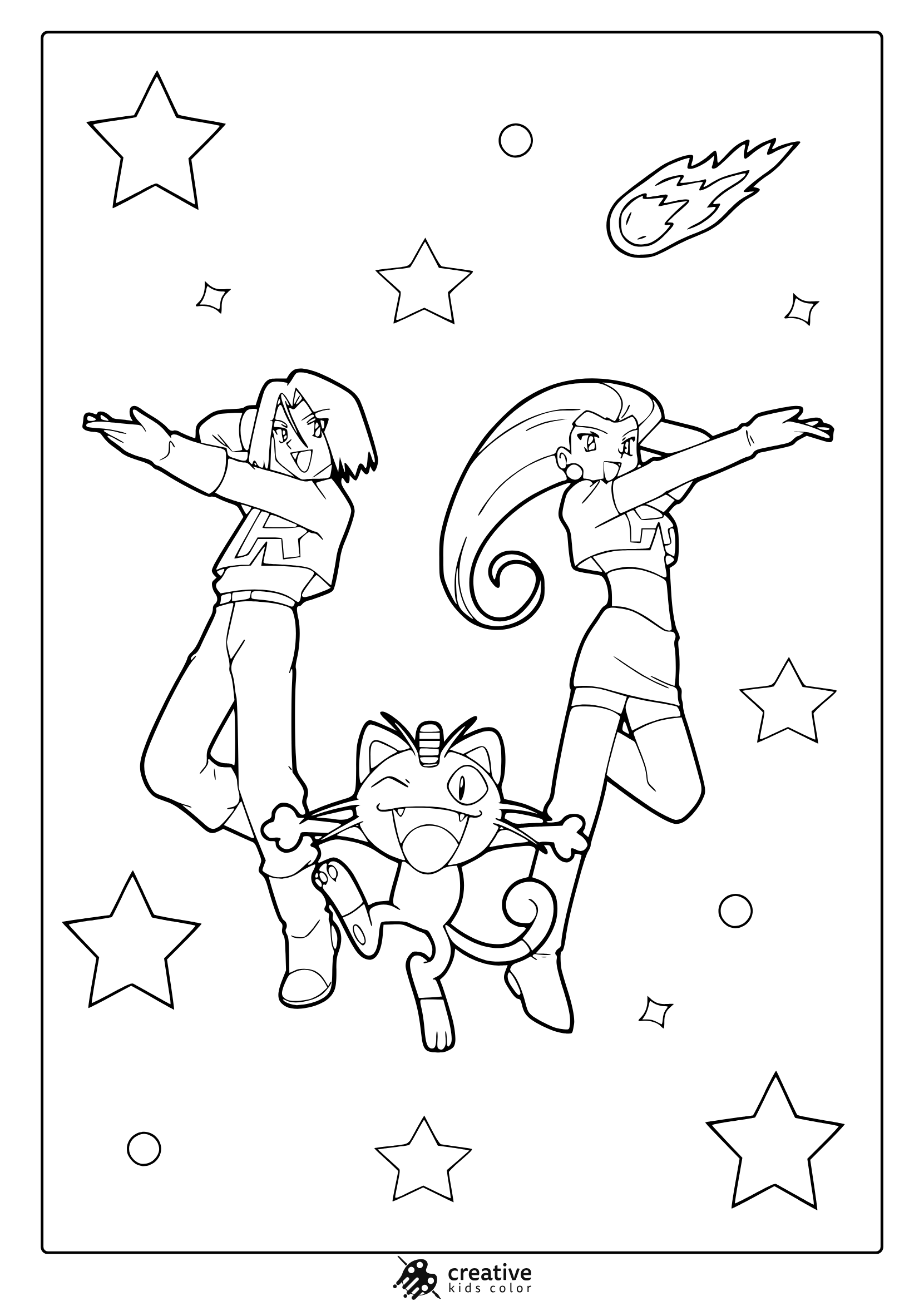
Team Rocket Jessie, James, and Meowth From Pokemon Coloring Page
Team Rocket blasts off among stars and comets in this action packed coloring page.
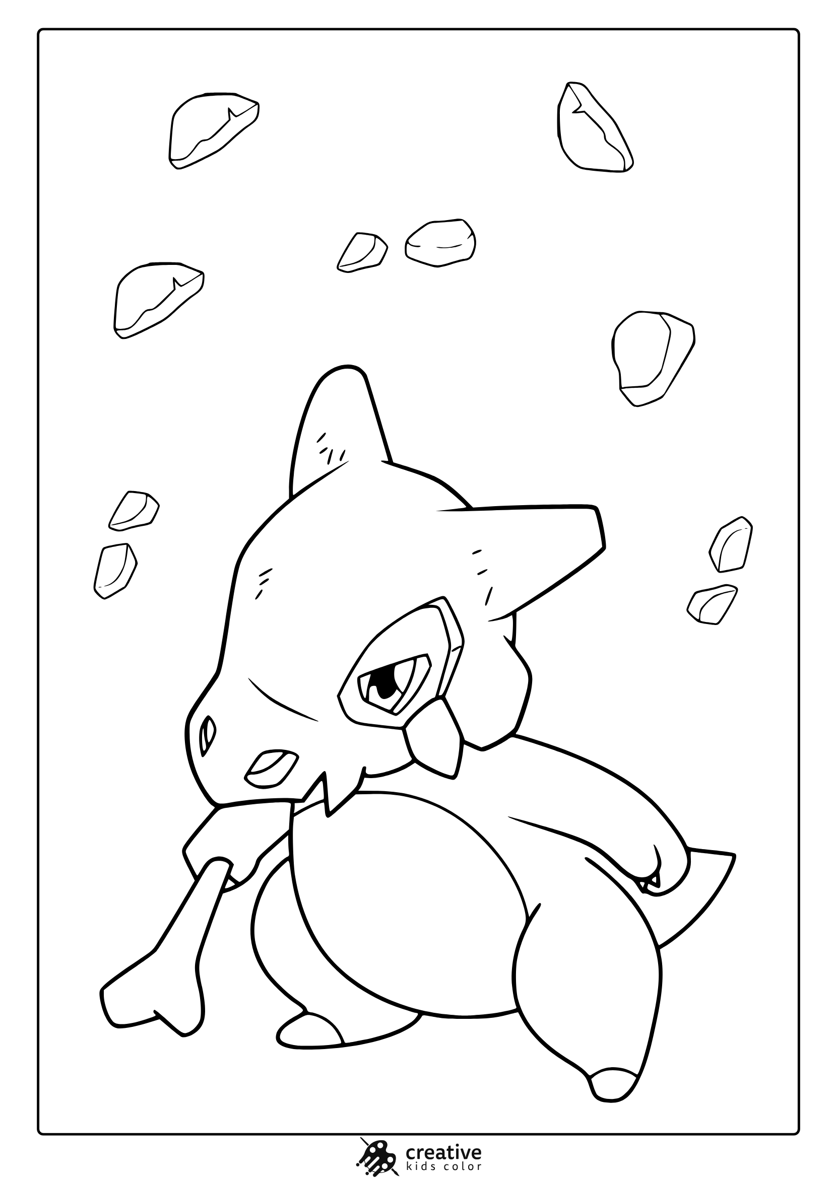
Cubone From Pokemon Coloring Page
Cubone stands quietly among scattered rocks, perfect for fans of this lonely Pokémon.
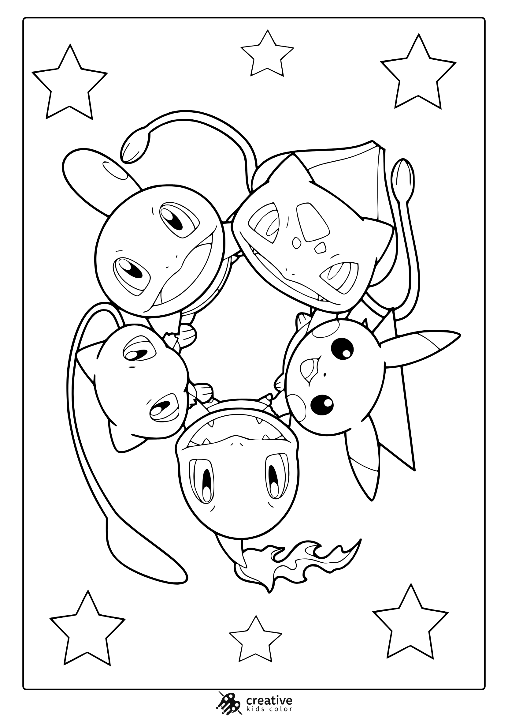
Cute Pokemon Coloring Page
A cute group of five Pokemon characters arranged in a starry circle for coloring fun.
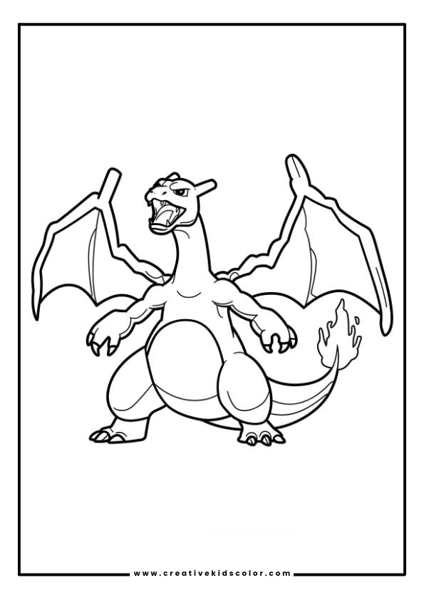
Charizard Pokemon Coloring Page
Charizard in an aggressive stance with wings, sharp claws, and a fiery tail.
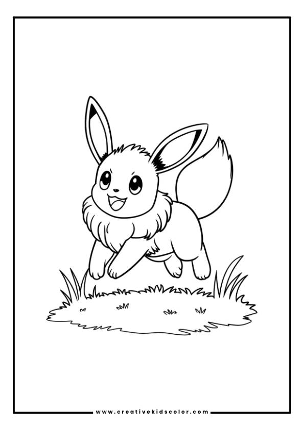
Eevee Pokemon Coloring Page
Eevee leaping over grass, with large eyes and a fluffy tail.
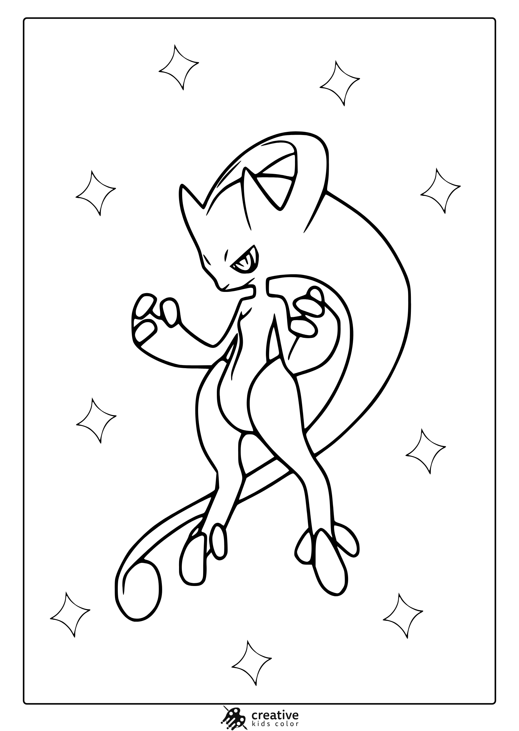
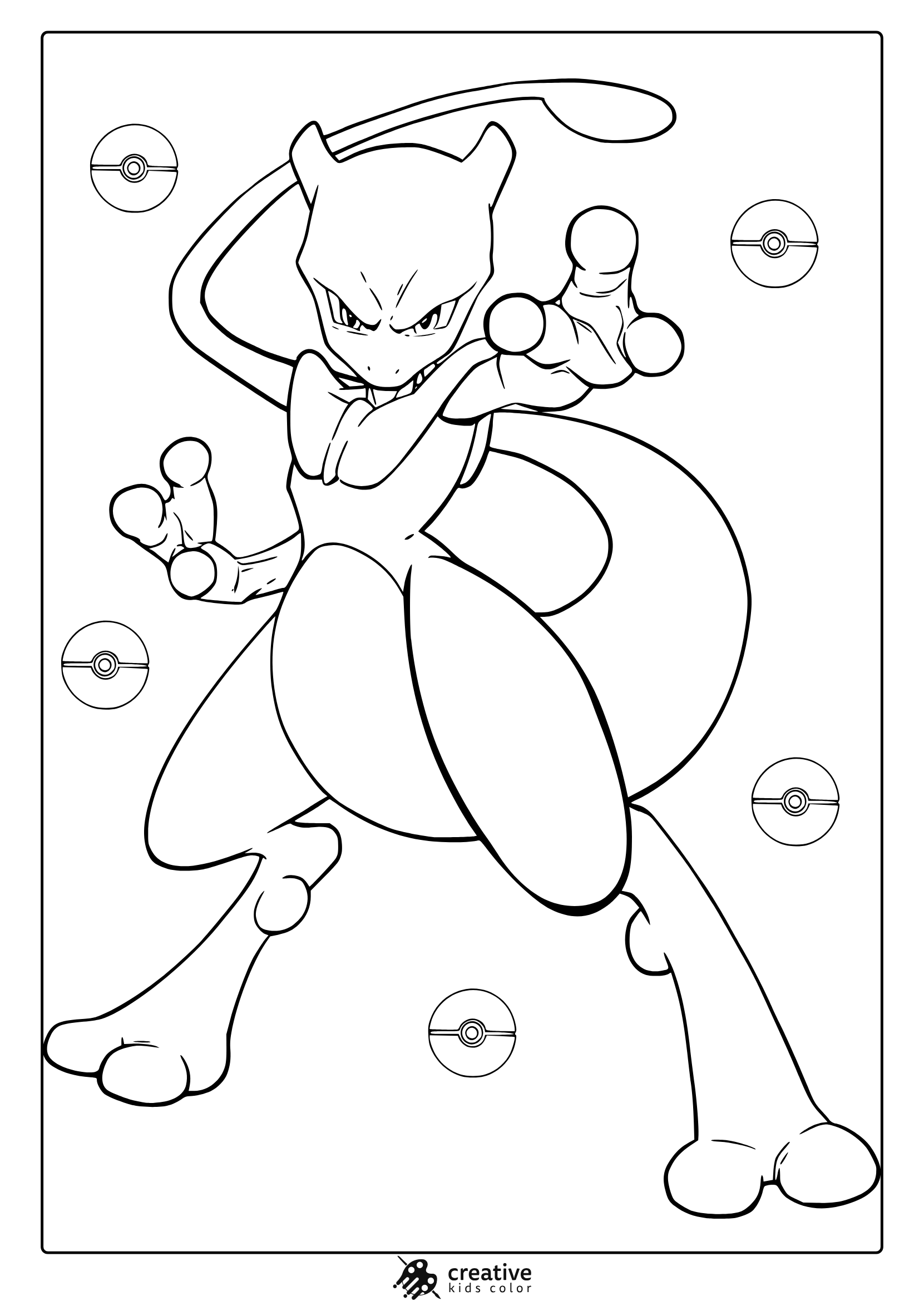
Mega Pokemon Coloring Page (Mega MewTwo)
Dynamic Mega MewTwo stands ready for battle in this bold and powerful coloring design.
Pokemon Christmas Coloring Page
Ash with Pikachu, both wearing Santa hats, beside a Christmas tree and presents.
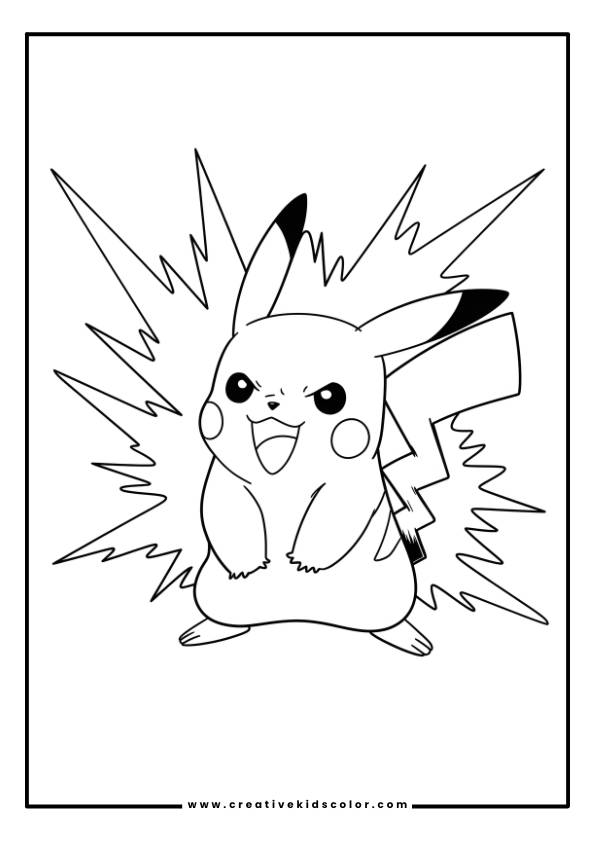
Pokemon Coloring Page Pikachu
Pikachu in an energetic pose surrounded by bursts of electricity.
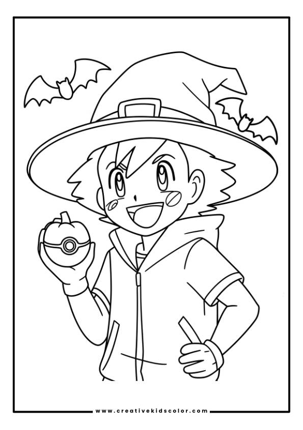
Halloween Pokemon Coloring Page
Ash with a wide-brimmed hat holding a round ball with an eye, with bats flying above.
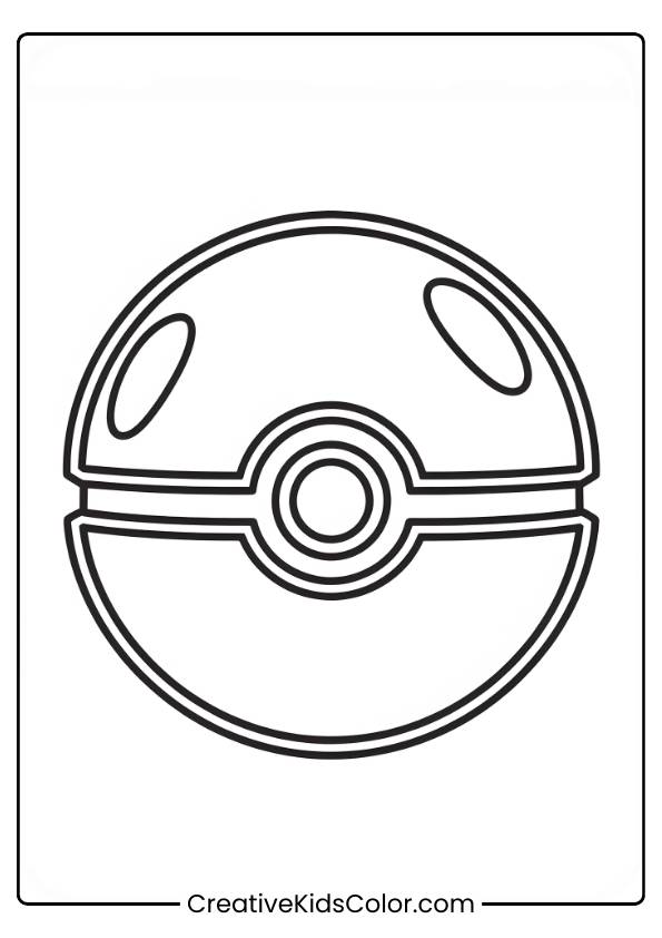
Pokemon Ball Coloring Page
A classic Poké Ball that looks big and distinct.
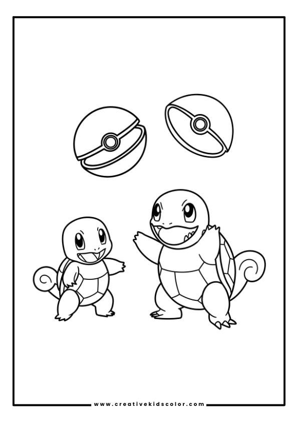
Pokemon Squirtle Coloring Page
Two Squirtle, one standing upright and one on all fours, with Poké Balls above them.
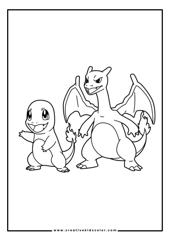
Charmander Pokemon Coloring Page
Charmander and its evolved form, Charizard, standing side by side.
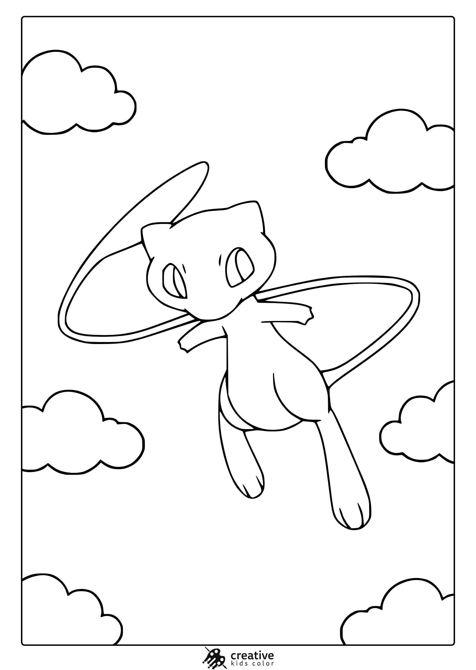
Mew Pokemon Coloring Page
Mew floats in a dreamy sky among clouds, ready for a soft and gentle coloring experience.
Mewtwo Pokemon Coloring Page
Mewtwo strikes a fierce pose with Poké Balls in this action filled line art coloring page.
Pokemon Adult Coloring Page
A pokeball for adults that loops with surrounding details.
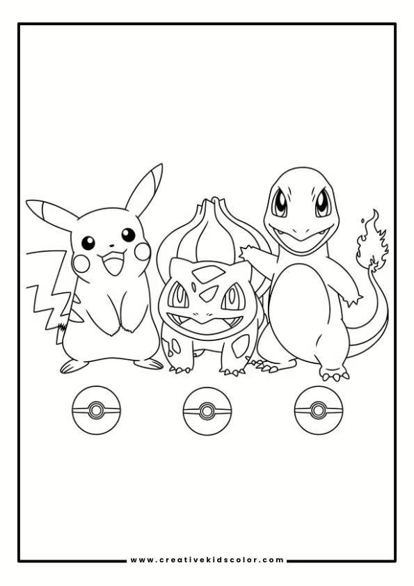
Pokemon Characters Coloring Page
Pikachu, Bulbasaur, and Charmander standing side by side.
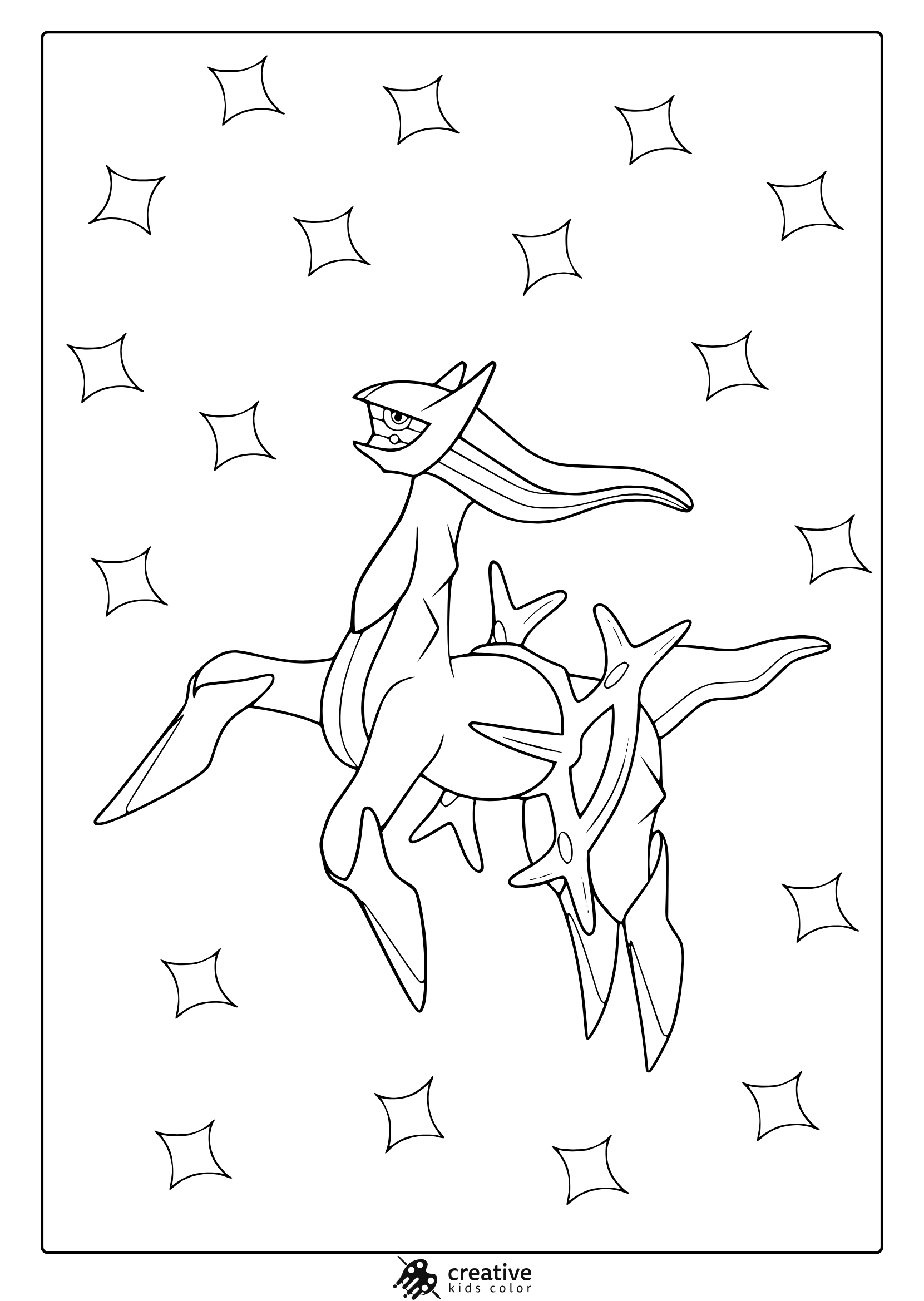
Arceus Pokemon Coloring Page
Arceus bursts with energy and detail in this powerful legendary creature coloring page.
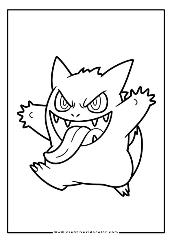
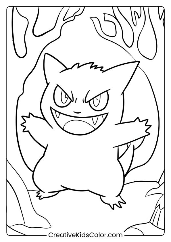
Gengar Pokemon Coloring Page
Gengar with a wide grin, sharp teeth, and glowing eyes, in a playful stance.
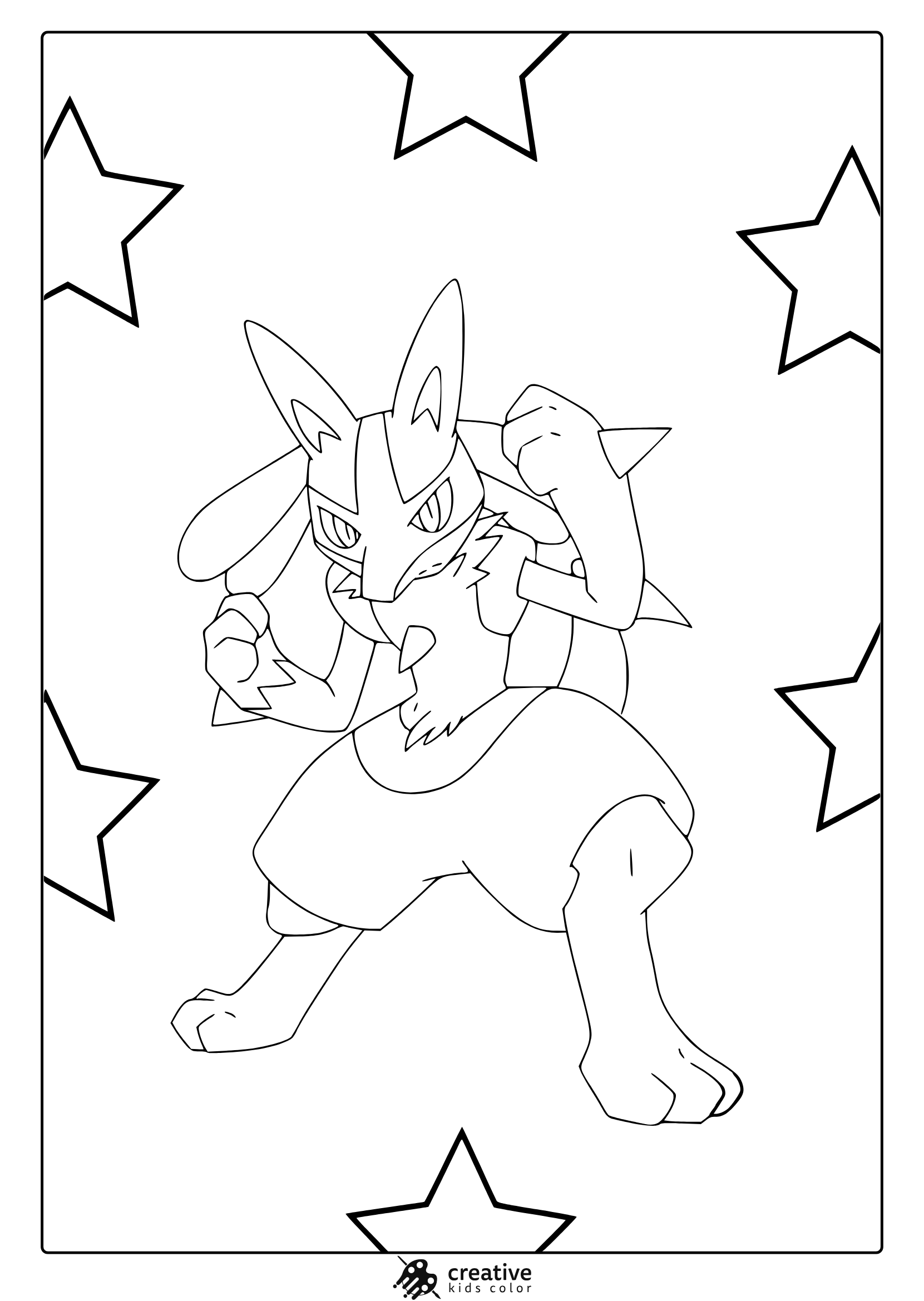
Lucario Pokemon Coloring Page
Lucario is charged up and ready to fight in this intense starry background coloring page.
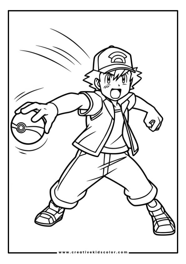
Pokemon Coloring Page Pokeball
Ash in a cap about to throw a Poké Ball in a dynamic action pose.
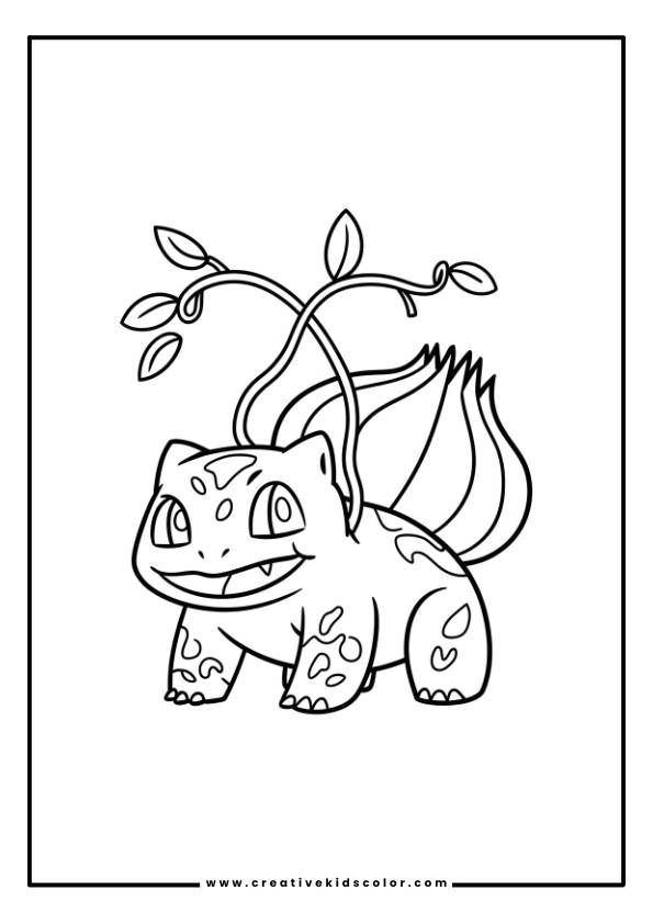
Bulbasaur Pokemon Coloring Page
Bulbasaur with a round body, large eyes, and a broad smile, ready for action.
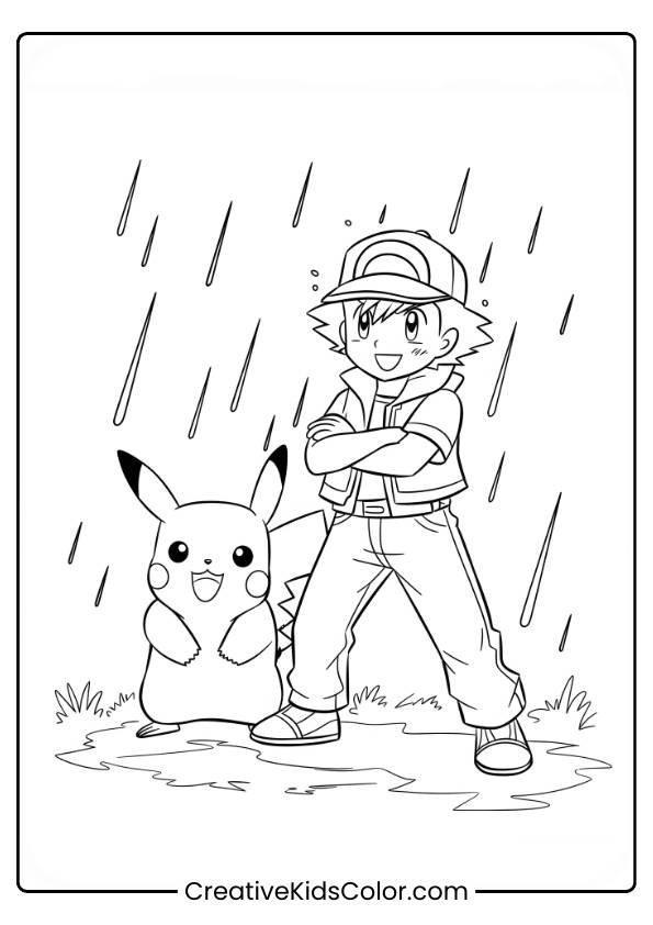
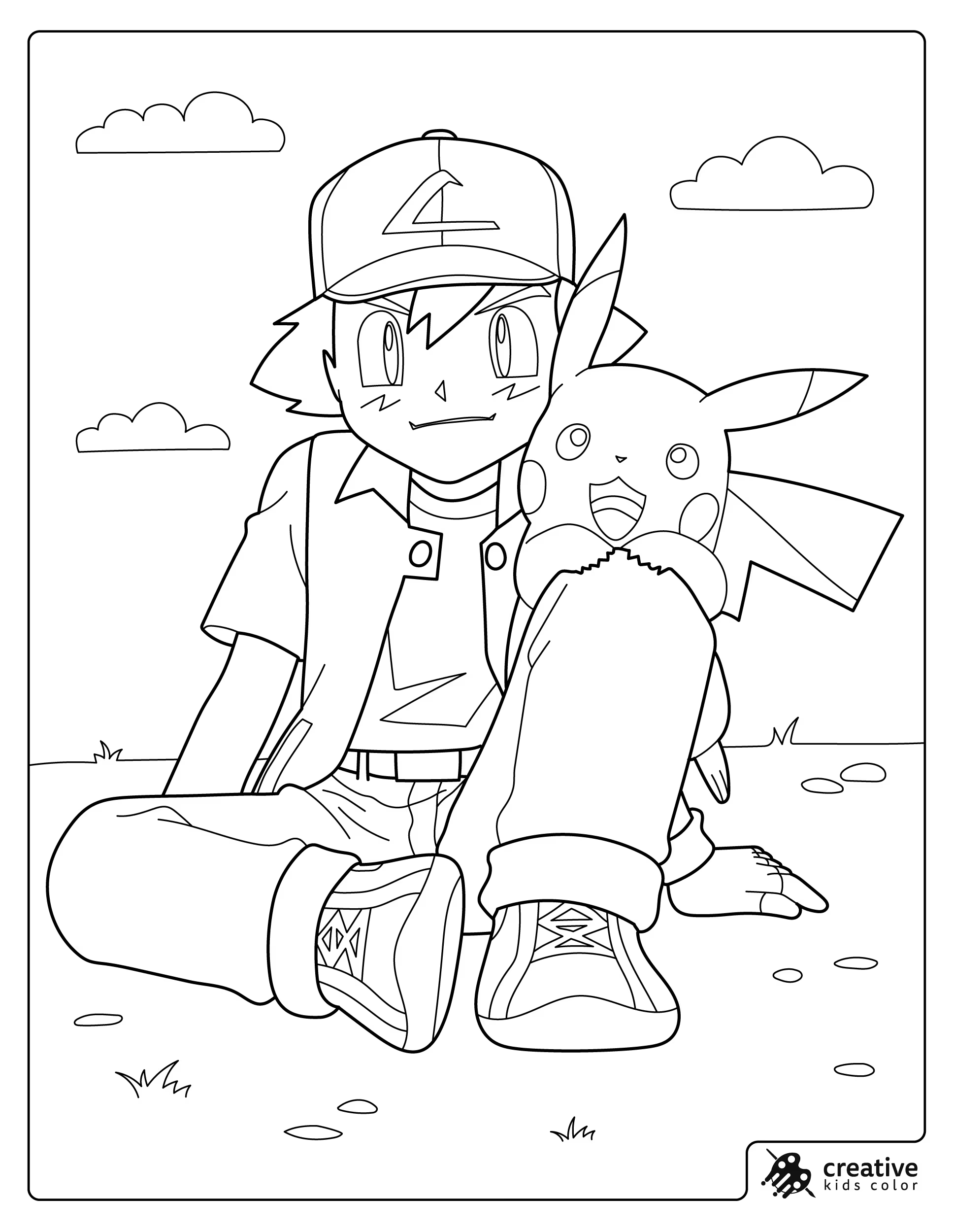
Ash Pokemon Coloring Page
Ash Ketchum standing confidently with Pikachu in a rainy outdoor setting.
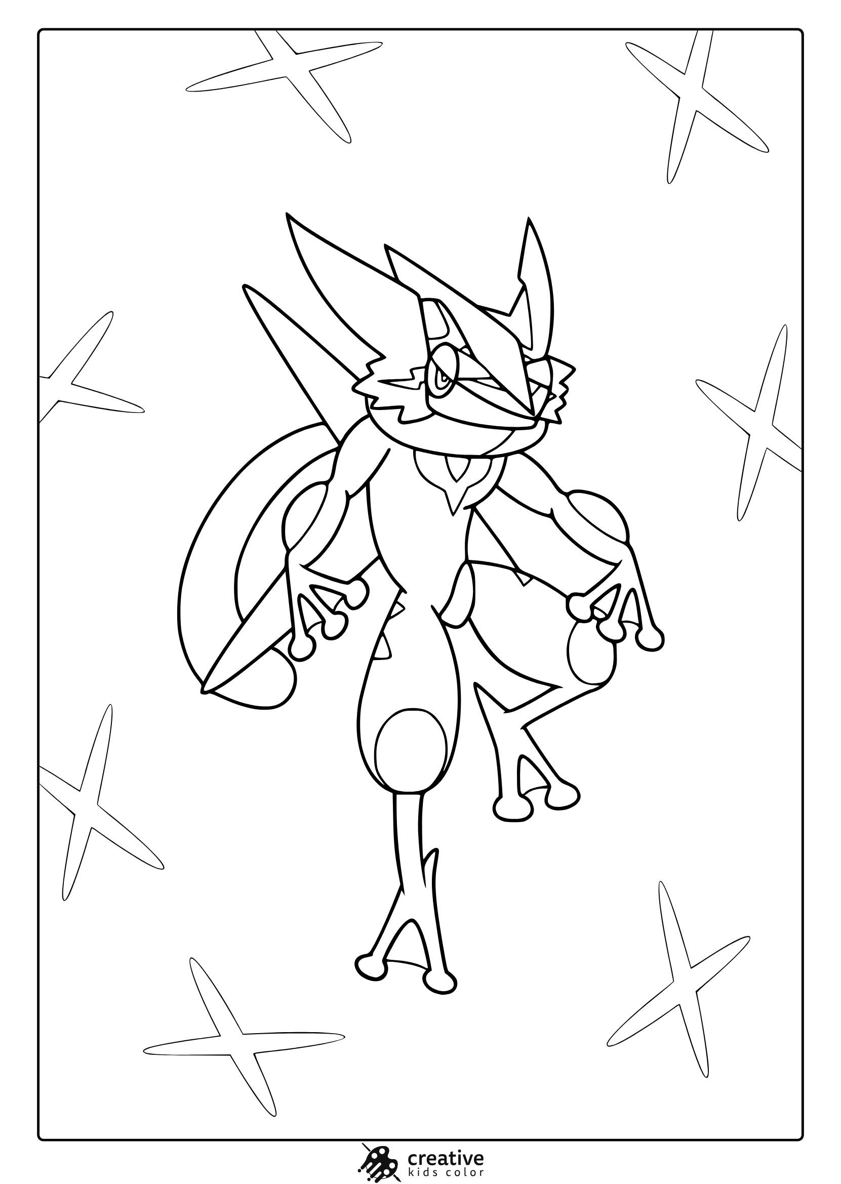
Greninja Pokemon Coloring Page
Greninja takes center stage in a sleek pose against a modern, starfish patterned backdrop.
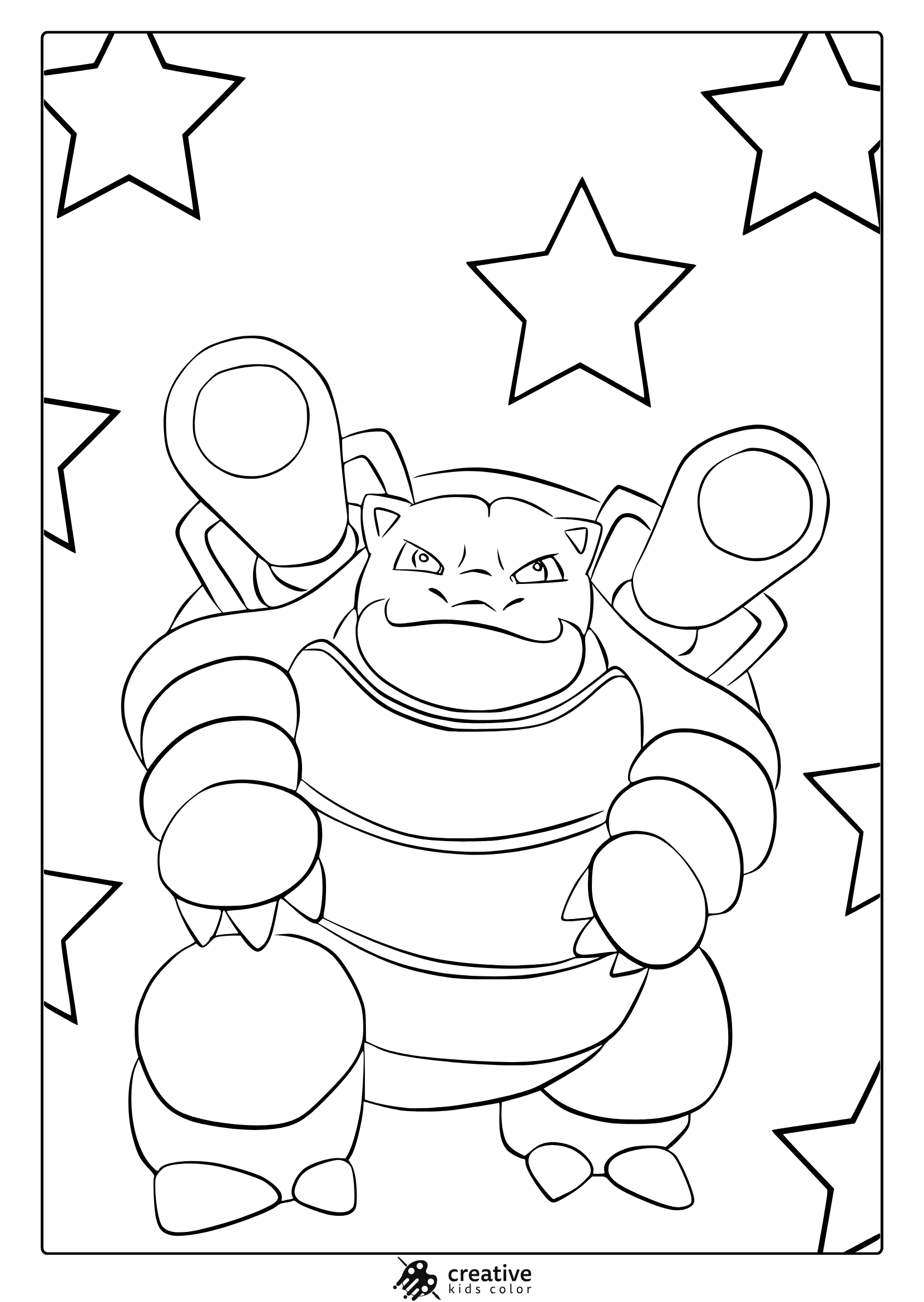
Blastoise Pokemon Coloring Page
Blastoise shows off its classic look in this bold, star framed coloring page.
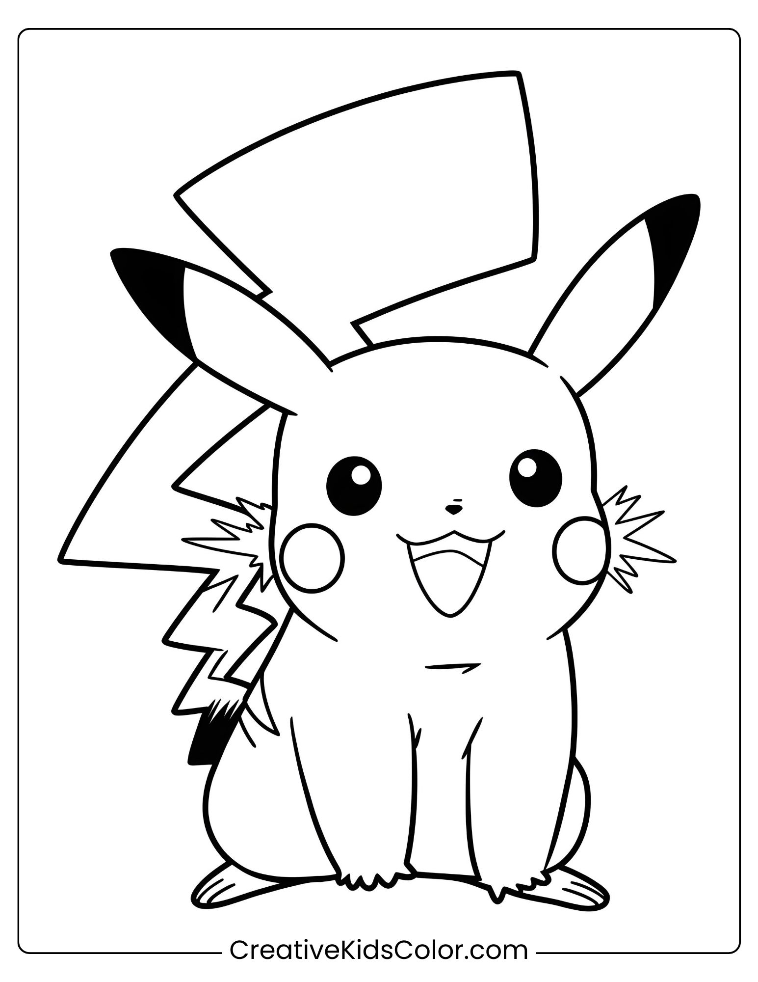
Pokemon Pikachu Coloring Page
Pikachu sitting cheerfully with its lightning bolt tail behind it.
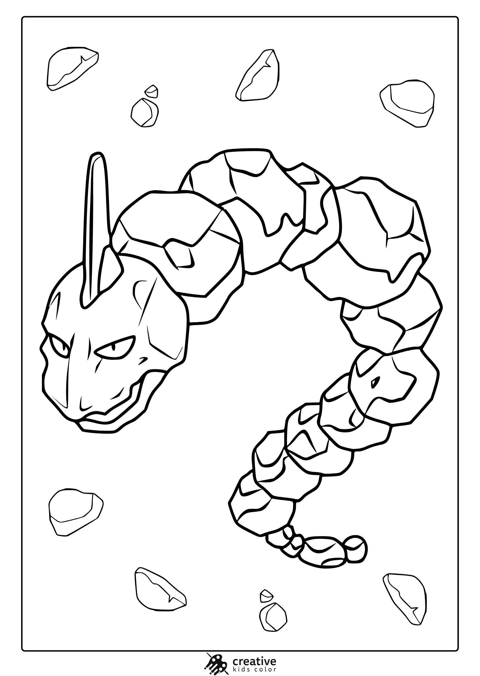
Pokemon Onix Coloring Page
Onix appears as a snake surrounded by rocky shapes, ready for creative coloring.
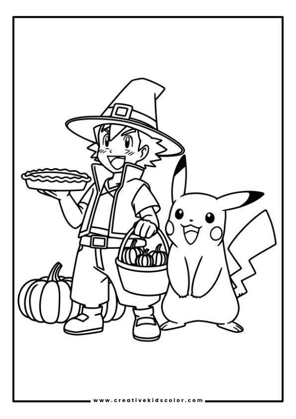
Pokemon Thanksgiving Coloring Page
Ash in a wizard hat holding a pie and pumpkins with Pikachu next to a large pumpkin.
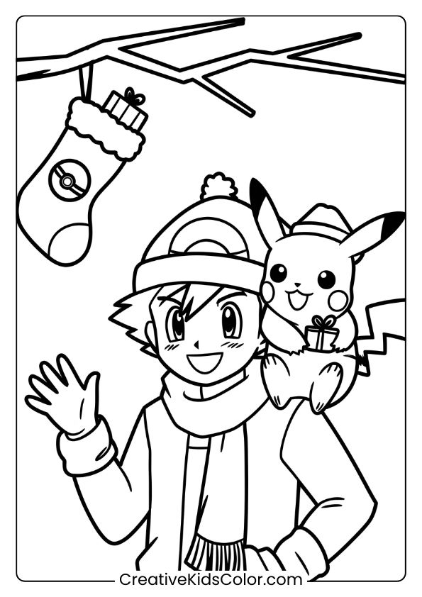
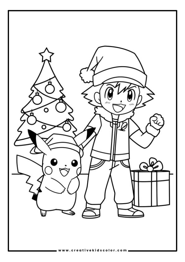
Christmas Pokemon Coloring Page
Ash and Pikachu celebrate Christmas together, dressed warmly with a festive stocking nearby.
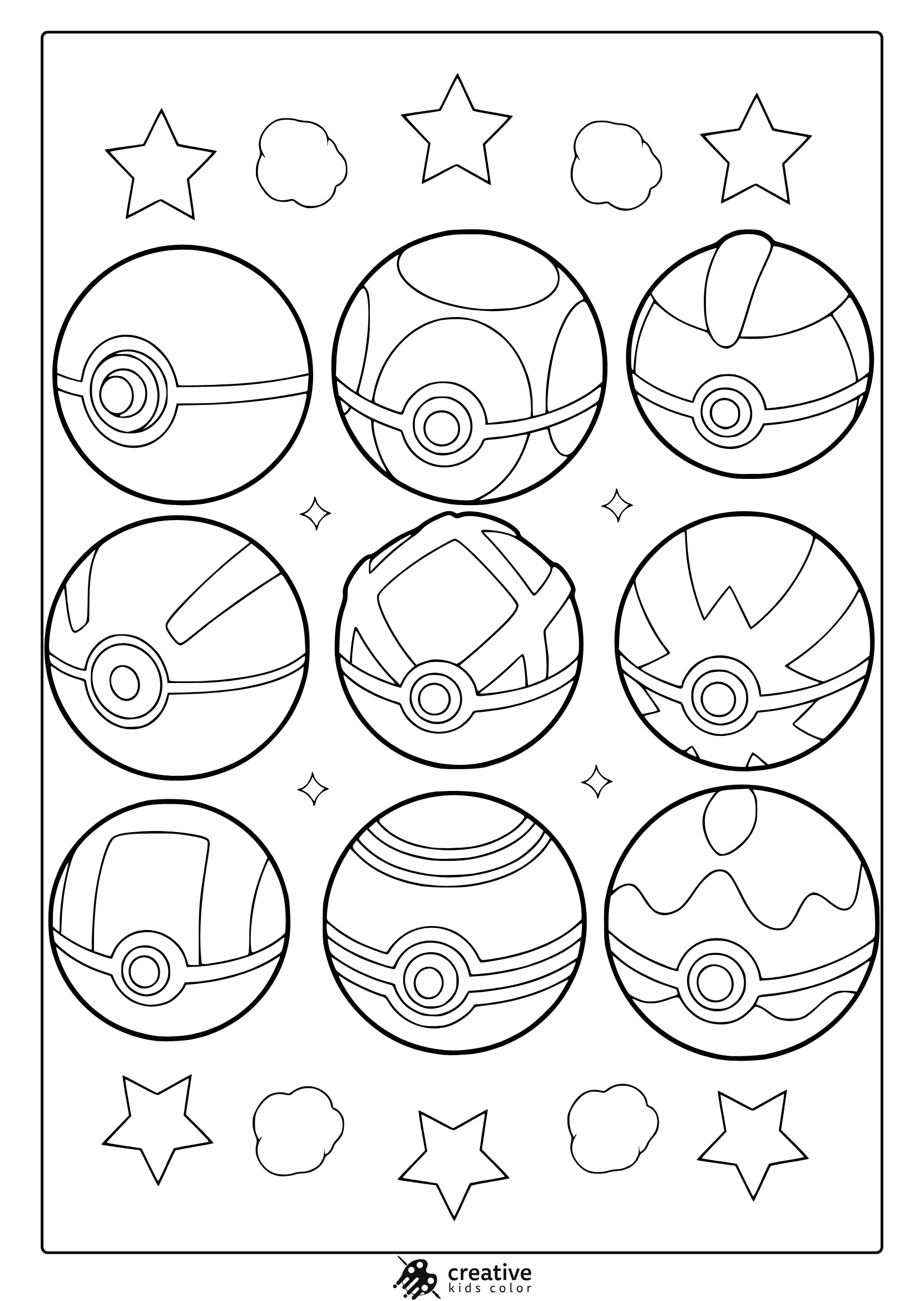
Pokeballs From Pokemon Coloring Page
Nine Poké Balls and playful stars make this a fun design for coloring and exploring Pokémon gear.
Ash and Pikachu Coloring Page
Ash and Pikachu sharing a peaceful sunny moment.
With so many printable Pokémon coloring pages to choose from, children can pick their favorite Pokémon to color in any way they like. Whether they want to bring a dynamic Charizard or an adorable Eevee to life with vibrant colors, these pages provide an excellent canvas for their imagination.
In conclusion, whether you’re a long-time Pokémon fan or simply seeking a fun and creative activity, Pokémon coloring pages offer endless entertainment. The vast selection of Pokémon coloring pages ensures that there’s always something new to color, and the convenience of free Pokémon coloring pages makes them an easy, accessible option for parents, teachers, and kids alike.
How to Color Pokemon Characters: Tips and Tricks
If you are printing these Pokemon coloring pages for home or the classroom, the easiest way to keep everything looking cohesive is to reuse a small color palette across multiple pages. This set includes a mix of trainers and Pokemon, so repeating a few core colors helps the whole stack feel together even when the scenes change.
Colored pencils are great for soft transitions and tidy edges, crayons are fast for big blocky shapes, and markers look clean when kids color in one direction and leave tiny highlights white.
Pikachu
Pikachu is simplest when you keep the yellow bright and the cheeks clearly red, then add black on the ear tips and small face details. If you want the tail to feel more classic, a little warm brown near the base helps.
Markers can make yellow look streaky, so slower strokes and one even layer usually looks best. With pencils, a light orange or golden yellow around the edges can add depth without turning Pikachu dark.
Ash Ketchum
Ash is easiest when you pick one main color for the jacket and one for the hat, then keep the rest neutral so his face and pose stay readable. If a scene has rain, trees, or holiday props, keeping Ash’s outfit steady makes the page feel less busy.
Hair and eyes are small areas, so do those after the big clothing blocks are filled. If kids use markers, letting the skin tone dry before touching the hairline helps avoid smudgy edges.
Charmander
Charmander looks most recognizable with a warm orange body and a bright flame that blends from yellow to orange to red. Keeping the belly a lighter cream makes the character pop on printed pages.
For the flame, crayons work surprisingly well if kids layer lightly instead of pressing hard at first. With pencils, a soft second layer on the outer edge of the body adds shape without heavy shading.
Charizard
Charizard usually reads best with orange as the main color and a cooler tone inside the wings, so the wings do not blend into the body. The tail flame can be your “fun detail,” especially if kids want to make it extra bright.
If the page has lots of lines, fill the big wing sections first so the smaller face details stay clean. With markers, outline the wing membranes before coloring so the edges stay sharp.
Bulbasaur
Bulbasaur is easiest when the body stays a soft blue green and the spots are a darker green, then the plant on its back gets its own clear green tones. Keeping the face area slightly lighter helps the expression look friendly.
Pencils are great here because kids can layer the darker spots gently instead of making them harsh. If crayons are used, light circular strokes keep the green from looking patchy.
Squirtle
Squirtle looks cleanest with a light blue body and a warm tan shell, then a slightly darker brown for the shell segments. If there is an underwater background, keep the water colors lighter than Squirtle so the character stands out.
Markers can make light blue streak, so one steady pass works better than multiple layers. With pencils, a slightly darker blue along the bottom edge adds a quick round look.
Eevee
Eevee is all about warm browns, a lighter brown base plus a darker brown for ears and shading, then a cream fluffy collar and tail tip. If kids keep the collar lighter, Eevee’s face stays easy to read even on smaller prints.
Crayons look good if children fill the big brown areas first and do the collar last. With pencils, blending the darker brown outward from the edges makes the fur look softer.
Piplup
Piplup is easiest with a simple blue body and a lighter face area, then small darker details to define the head and flippers. The beak and feet can be a warm yellow so they do not disappear into the blue.
If kids use markers, it helps to color the face first and then fill the darker blue around it. With pencils, a gentle darker outline on the flippers keeps the shape crisp.
Meowth
Meowth looks best with a light cream or pale tan body, then darker tan accents for ears and tail. The coin on the forehead should stay bright yellow so it reads instantly.
For clean edges, color the coin and face details first, then fill the body. If crayons are used, light pressure keeps the cream tones smooth.
Jessie
Jessie stands out when you keep her hair bold and cleanly filled, then use a simple red and white palette for the outfit. If the background has stars or motion lines, repeating one of her outfit colors there can make the scene feel connected.
Markers work well for big hair shapes if kids color in one direction. With pencils, a slightly darker pass near the hair edges adds depth without extra colors.
James
James is easiest when you keep the outfit simple and let the hair color be the main focus. Clean color blocks usually look more Pokemon than lots of shading.
If kids are using markers, outline the clothing shapes first so the uniform looks tidy. With pencils, keep the face area lighter so the expression stays clear.
Wobbuffet
Wobbuffet reads best with a strong blue body and darker blue around the outline areas, then a clean black tail shape. The mouth and eyes are small, so saving them for last helps keep the face neat.
Crayons can fill the big body quickly, then pencils can refine the edges if needed. With markers, avoid stacking too many layers of blue so it stays smooth.
Jigglypuff
Jigglypuff looks sweetest when the pink stays light and airy, with slightly deeper pink around edges for shape. The eyes are the main detail, so keeping them clean makes the whole page feel polished.
Pencils are perfect for soft pink because kids can build color slowly. If markers are used, one even layer plus tiny highlights left white keeps it from looking too dark.
Gengar
Gengar works best when you pick one main purple and one darker purple for shadows, then keep the grin and eyes sharp so the character feels mischievous. If the scene is spooky, a cool gray background can add mood without stealing attention.
With pencils, blend the darker purple near the edges and keep the center a little lighter. With markers, color the eyes first so they stay bright and clean.
Moltres
Moltres looks great when kids treat it like layers of flame, starting with yellow as a base and adding orange and red on the outer feather tips. Leaving small white gaps can make the fire feel more lively.
Markers can look amazing here if children work from light to dark. With pencils, short strokes along feather directions keep the texture natural.
Corviknight
Corviknight is easiest with deep grays rather than pure black, then a lighter gray to separate feathers and armor plates. If there is snow or clouds, keep the background light so the dark bird stays readable.
Crayons can make large dark areas waxy, so pencils often look cleaner. With markers, a dark gray base plus a few lighter gray highlights is usually enough.
Venusaur
Venusaur works best with green tones for the body and a stronger contrasting color for the flower on its back. If kids keep the face a little lighter, the expression stays friendly.
With pencils, layer the darker greens around the spots and edges. With crayons, filling the big body first and then doing the flower details keeps it manageable.
Blaziken
Blaziken looks most recognizable with a warm red and yellow palette, then darker accents to separate the leg shapes and arm details. If the page shows flames, using a lighter yellow near the center keeps the energy effect bright.
Markers can make reds intense fast, so a lighter hand helps. With pencils, adding orange near edges can make the red feel more dynamic without changing the main color.
Togepi
Togepi is easiest when you keep the egg shell mostly white or very light cream, then use a small set of bright accents for the triangle shapes. If kids pick two or three accent colors and repeat them, it looks tidy and intentional.
Crayons are great for the bold shapes because kids can fill them quickly. With pencils, a light gray shadow under the egg helps it sit on the page.
Snorlax
Snorlax looks best with one main blue for the body and a lighter cream for the belly and face. Keeping the outline areas clean matters more than shading, because the shape is already iconic.
If kids use markers, fill the belly first so the cream stays clean. With pencils, a slightly darker blue under the arms and belly edge adds simple depth.
Koffing
Koffing works well with purples and small darker accents for the face details, plus light gray or pale purple gas cloud shapes around it. Keeping the eyes and mouth crisp makes the character easier to read.
Crayons can fill the round shapes quickly, then pencils can add darker accents. With markers, leaving tiny highlights uncolored makes the round body feel more three dimensional.
Gyarados
Gyarados looks great when kids choose a strong blue palette, then use a slightly darker blue to separate the body segments and fins. If there are clouds or waves, keeping them lighter helps the big shape stand out.
With pencils, shade the underside of each segment just a little. With markers, define the fins first and fill the large body last to keep edges clean.
Cubone
Cubone reads best in warm browns and light creams, with the skull helmet kept pale so it stands out from the body. If rocks or ground details are on the page, using one gray tone keeps the scene grounded.
Crayons are great for the simple brown blocks. With pencils, a slightly darker brown along the legs and underside adds quick depth.
Mew
Mew looks sweetest with very light pink and lots of white space left on the page, especially if it is floating among clouds. A soft pastel approach usually matches the gentle pose.
Pencils are ideal because kids can keep the pink subtle. If markers are used, one light layer is better than multiple passes.
Mewtwo
Mewtwo works best with cool neutrals, light gray or pale lavender for the body and a deeper purple for the tail and accents. Keeping the face area lighter makes the eyes and expression stand out.
With pencils, build the darker tail color slowly so it stays smooth. With markers, color the lighter body first, then add the darker tail after it dries.
Arceus
Arceus looks cleanest when you keep the body mostly light, then use a small set of accent colors for the ring and details. Too many extra colors can make the design feel noisy, so simple contrast is the win.
With pencils, a light gray shadow under the body adds depth without changing the legendary look. With markers, outline the accent shapes first so they stay crisp.
Lucario
Lucario is easiest with strong blues plus black accents, then a cream chest area so the main shapes are clear. If kids want a little extra flair, one bright accent color in the background can look great without clutter.
Pencils help keep the blue smooth and layered. With markers, color the cream chest first so the dark areas do not bleed into it.
Greninja
Greninja works best with deep blues and clean contrast around the face and scarf area so the pose reads clearly. If the background has patterns, keeping them light makes the character stand out.
With pencils, a darker blue along the edges can make the body feel sharper. With markers, slow consistent strokes keep the dark blues from looking patchy.
Blastoise
Blastoise looks most recognizable with blue body tones and a warm brown shell, then darker accents for the cannons. If kids keep the shell a shade warmer than the body, the shapes separate naturally.
Crayons fill the shell fast, then pencils can refine the cannon edges. With markers, outline the cannon shapes first so they stay clean.
Onix
Onix looks great with a simple gray palette, one light gray base and one darker gray for segment edges. If the scene includes rocks, repeating the same gray tones keeps it cohesive.
With pencils, add the darker gray under each segment to suggest stacking. With crayons, light pressure prevents the gray from looking too waxy.
Lilligant
Lilligant is easiest when kids choose two greens plus one flower color, then keep the face and petal areas lighter so the character feels fresh. A clean, simple palette usually looks more game accurate than lots of shading.
With pencils, softly deepen the greens near the edges. With markers, color the petals first and fill the greens after so the flower stays crisp.
Poké Ball
A Poké Ball is clean and satisfying to color because it is mostly bold blocks of red, white, and a small gray or black center button. If kids want it to look shiny, leaving a small curved highlight uncolored does the trick.
Markers look especially crisp on the red half if kids keep strokes in one direction. With pencils, a slightly darker red along the outer edge adds simple depth.
I like your color pages